SparkMap may experience intermittent outages from 8 pm CT July 26 - 12 pm CT July 27 for site maintenance. We recommend saving frequently during this time.
How to Use the COVID-19 Vulnerability Footprint Tool
The SparkMap COVID-19 Vulnerability Footprint Tool highlights communities vulnerable to COVID-19 by identifying where there are high concentrations of older populations, the uninsured, and high population density. Data are derived from the US Census Bureau 2014-18 American Community Survey.
1
Access the COVID-19 Vulnerability Footprint Tool
2
Use the COVID-19 Vulnerability Footprint
3
Overlay Other Map Layers
4
Generate Demographic Report
Step 1 – Access the COVID-19 Vulnerability Footprint Tool
Navigate to a location of interest by zooming into the map, or searching for the location.
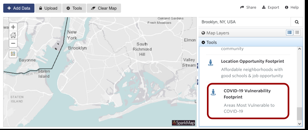
Navigate to Tools on the right hand menu and select “COVID-19 Vulnerability Footprint” (Figure 1).
Figure 1: Location of COVID-19 Vulnerability Footprint Tool in the Map Room
Interested in more COVID-19 data? Check out our COVID-19 assessment, starter maps, and dashboards: COVID-19 Resources.
Step 2 – Use the COVID-19 Vulnerability Footprint Tool
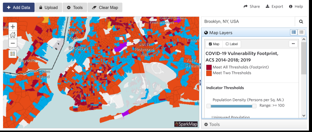
Once you’ve opened the Tool, the map will populate with colors representing different thresholds (Figure 2).
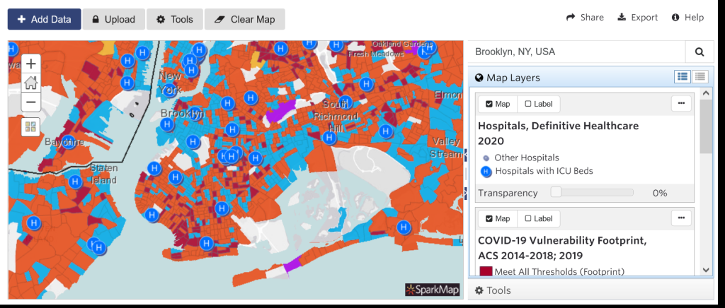
Figure 2: COVID-19 Vulnerability Footprint for Brooklyn, NY
Dark red () represents census tracts that meet all criteria
Orange () represents areas that meet 2 of 3 thresholds
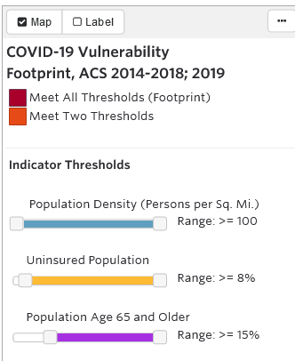
The indicators used in this tool determine levels of vulnerability in three areas:
Population densitypersons per square mile
Uninsured population
Population age 65 or older
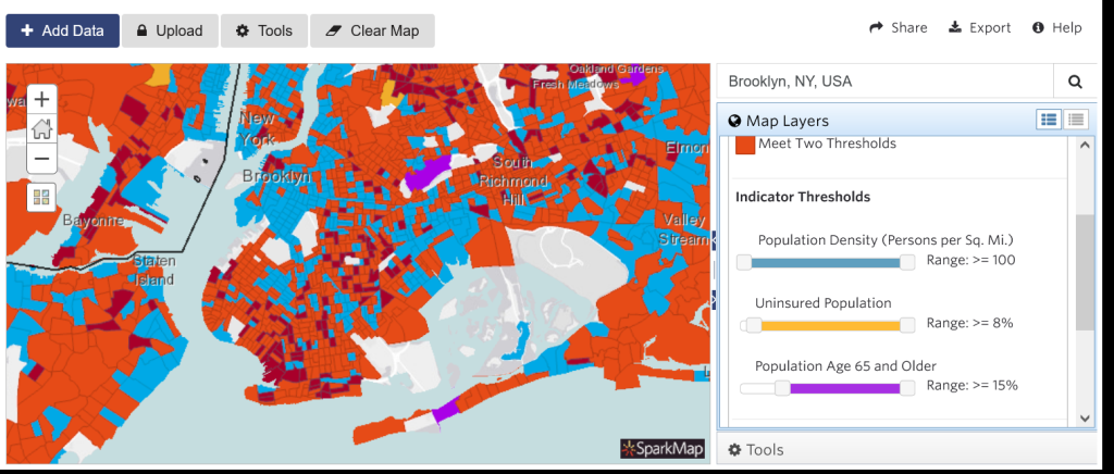
Once you’ve loaded the Tool, adjust the indicator threshold values using the sliders (Figure 3) – the map will dynamically populate areas affected by the updated thresholds.
Thresholds for determining levels of vulnerability can be adjusted using three sliders, and areas where multiple thresholds are exceeded are highlighted in red. The map will dynamically populate areas affected by the updated thresholds.
Figure 3: Location of indicator threshold sliders
This tool allows users to adjust for spatial variation and relative importance of the three vulnerability factors. For example, to prioritize a larger uninsured population, slide the second meter to a higher value. We recommend that you adjust these thresholds based on the unique conditions of the area you are examining.
Step 3 – Overlay Other Map Layers
You can easily map other data with this tool. Click the “Add Data” tab at the top left to start adding layers to your map.
For our example here, we added hospitals to our map – these hospitals and the COVID-19 Vulnerability Footprint are now both visible on our map (Figure 4). Adding more data like this can create a more thorough understanding of other indicators that may be associated with the vulnerable populations you’ve highlighted.
Step 4 – Generate a Demographic Report
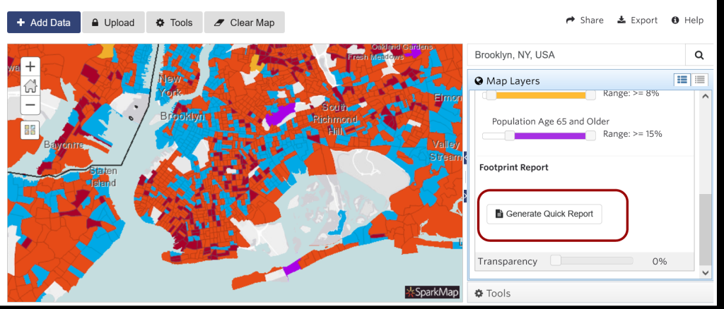
The COVID-19 Vulnerability Footprint Tool also includes a handy Quick Report that summarizes demographic information as well as additional vulnerable population data.
In the Footprint Map Layer pane, scroll down to access the “Generate Quick Report” button (Figure 5).
Figure 5: Button location to generate Quick Report
This report contains the generated map, legend, basic demographic information, race/ethnicity breakouts, gender/age breakouts, and more detail about the vulnerable populations.
For an example Demographic Report, click here (PDF).
You can continue to add additional layers, save, export, or share your map. For more information on how to use the Map Room, explore our other support materials.