How to Use the Vulnerable Populations Footprint Tool
The SparkMap Vulnerable Populations Footprint Tool (“VPF Tool”) can help you understand and address disparities in communities by identifying vulnerable populations at a sub-county level. The tool highlights the overlap between areas with high rates of poverty and areas with low rates of high school graduation.
Navigate to a location of interest by zooming into the map, or searching for the area.
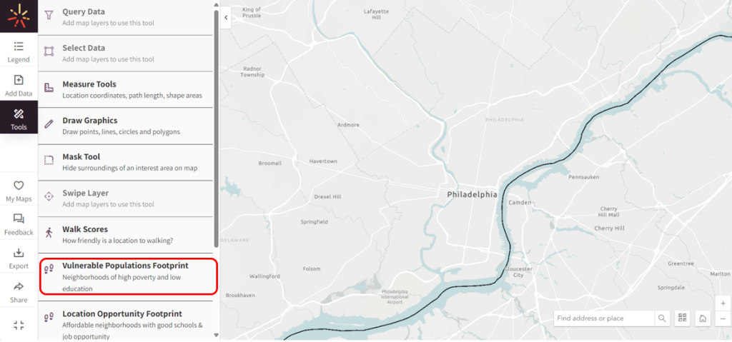
Navigate to Tools on the left-hand menu and select “Vulnerable Populations Footprint Tool” (Figure 1, circled in red).
Figure 1: Vulnerable Populations Footprint tool location in Map Room
Looking to create a ZIP code-level community needs assessment? You can do so with a Premium Annual Subscription. Already a Premium Annual Subscriber? Check out our tutorial, How to Build A ZIP Code-Level Community Needs Assessment.
Step 2 – Use the VPF Tool
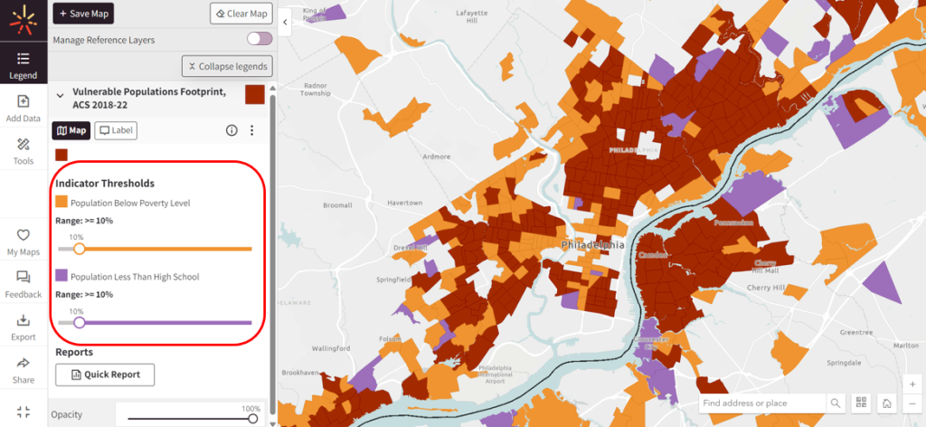
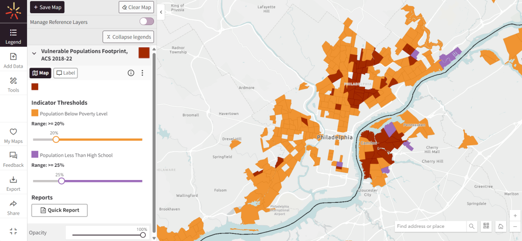
Once you’ve opened the Tool, the map will populate with colors representing three thresholds (Figure 2):
Orange represents areas with a population below the poverty level
Purple represents areas with a population with less than a high school education
Maroon represents our potentially vulnerable areas – where both indicators exceed the default thresholds
Once you’ve loaded the VPF tool, adjust the indicator threshold values using the sliders – the map will dynamically populate areas affected by the updated thresholds (Figure 3).
Figure 3: Location of Indicator Threshold sliders
We recommend that you adjust these thresholds based on the unique conditions of the area you are examining.
Step 3 – Overlay Other Map Layers
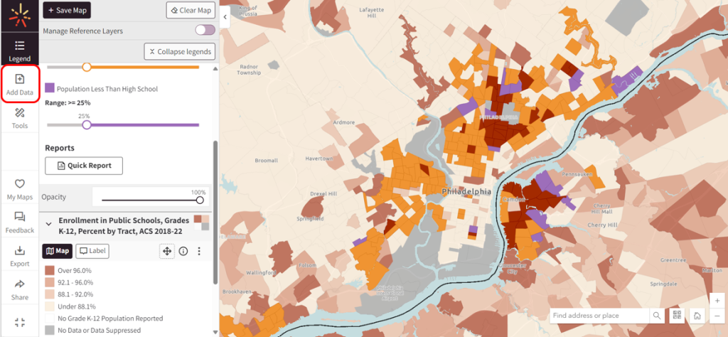
You can easily map other data with this tool. Click the “Add Data” tab on the menu to the left to start adding layers to your map (Figure 4).
For our example here, we chose to add enrollment in public schools, grades K-12. The enrollment layer and the VPF are now both visible on our map (Figure 4). This creates a more thorough understanding of other indicators that may be associated with the vulnerable populations you’ve highlighted.
Step 4 – Generate a Demographic Report
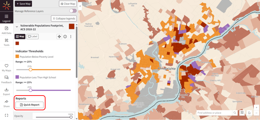
The VPF Tool also includes a handy Quick Report that summarizes demographic information as well as additional vulnerable population data.
In the VPF Map Layer pane, scroll down to access the “Generate Quick Report” button (Figure 5).
As an important note, this report only highlights your most vulnerable populations (i.e., areas that meet both the population below poverty level AND population with less than a high school diploma). These are the maroon areas on your map. If there are no areas that meet both thresholds on the focus area of your map, you cannot generate a Quick Report. By using the sliders to adjust your thresholds, you’ll see areas of your map dynamically change as they meet different criteria.
Figure 5: Button location to generate demographic report
This report contains the generated map, legend, basic demographic information, race/ethnicity breakouts, gender/age breakouts, and more details about the vulnerable populations.
For an example Demographic Report, click here (PDF).
You can continue to add additional layers, save, export, or share your map. For more information on how to use the Map Room, check out our support materials.

 Orange represents areas with a population below the poverty level
 Purple represents areas with a population with less than a high school education
 Maroon represents our potentially vulnerable areas – where