Choosing the Right SparkMap Product for You
What brought you to SparkMap? Was it our mission to bring you all the data you need, ready to go, all in one place? Was it the 279 indicators you can use to create Community Assessments? Or, perhaps you were interested in using our Map Room to tell the story of your community through some of our nearly 32,000 map layers? These are all parts of SparkMap that set it apart and we want to make sure you know which products will be most helpful to YOU.
How can I use SparkMap?
We created SparkMap with the goal of providing a one stop shop for reliable accessible data and visual creation. We wanted to make it as easy as possible for you, our subscribers, to find the data you need and with a couple of clicks generate interesting and easy to understand charts, graphs, and maps. We’ll dive a little bit more into our two products below, but be sure to check out our use cases and industry specific pages for examples on how we think our tools could be useful to you!
Products? Which products are you talking about?
At SparkMap, our two main products are the Community Needs Assessment and the Map Room. Both of these are focused on helping you visually present data. But, how do you know which products is best for your needs?
Choosing the Community Assessment
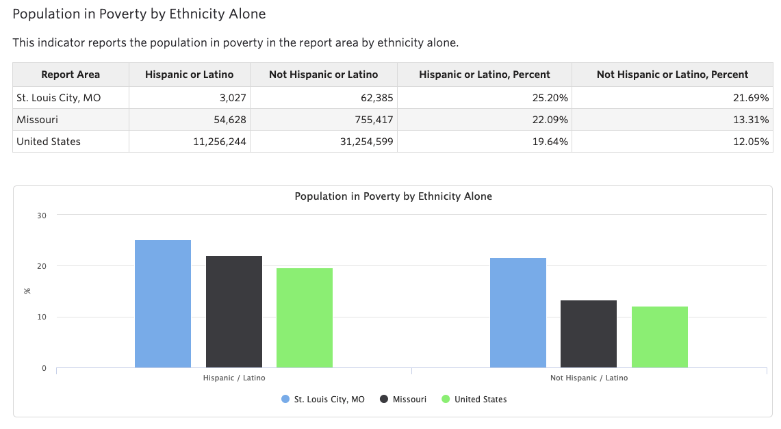
The Community Assessment is the perfect product for creating Community Health Needs Assessments, diving into the well-being of an area, looking at health indicators, and identifying the greatest needs of a community. We think it is especially helpful for hospitals, public health departments, health-related organizations, and other users who complete Community Needs Assessments. When thinking about what makes SparkMap’s Community Assessment tool superior to others, it comes down to one important factor: our data. All of the data you choose to include in your Community Assessment has been expertly benchmarked, and if you’re a Premium Subscriber, you can add indicators at the Zip Code level too! In addition, our reports are helpful because the clear graphs and charts can be easily downloaded and used in your presentations or materials. These can be added as useful parts of grant writing or public policy agenda setting too! Interested in learning more about the community assessment? We’ve created some samples for you to browse and have also included examples of how we envision it being used!
Choosing the Map Room
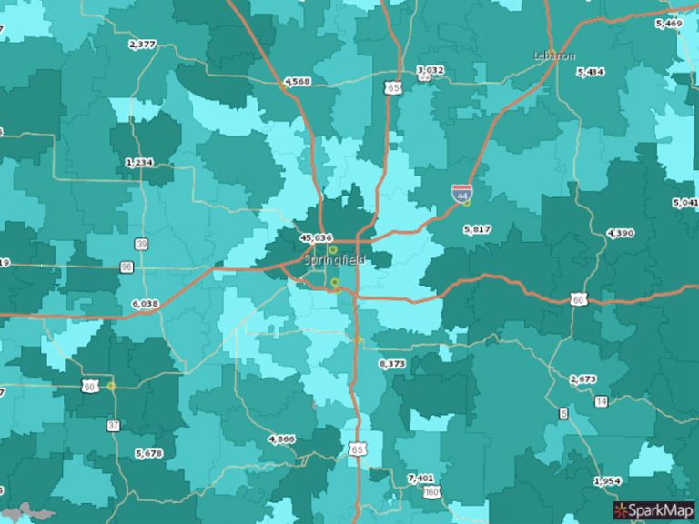
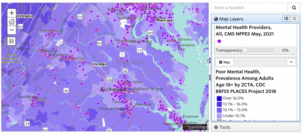
The Map Room is best to use when you’re looking to create a custom map! In the Map Room, you can create custom data-based maps of an area (e.g., state, county, and census tract) to use in presentations, on social media, and in print materials. You select the layers that are important to your questions, like mental health providers in an area and poor mental health prevalence among adults, and our tools will create a color coded map with data interpretation tools for you! Plus, as a subscriber you can upload and map your own data! Interested in learning more about the Map Room? Check out our Starter Map Gallery to begin interacting with our maps and check out our Use Cases for ideas of how you can use the Map Room.
Looking Ahead
We know there’s a lot of information in this blog, but believe it or not it’s a pretty simple overview of SparkMap. In our blogs to come, we will be taking a deeper dive into the Map Room and Community Assessment to make sure you’re getting the most of your SparkMap experience!