
Enhancing Data Literacy pt. 2: Interpreting Maps
Creating lasting change in your community is only possible when you have an accurate understanding of its strengths and needs. In other words, you need community-level data in order to determine outreach needs, pinpoint service areas, and identify areas in which your community already excels. We believe the best way to do this is through data. With your SparkMap subscription, you can easily create high quality Assessments and maps. Our interactive, customizable Map Room can prove especially useful, as it allows you to explore community data in a geographic context. However, being able to interpret these maps is essential for translating data into action.
This blog post is the second in our ongoing series focusing on data literacy. In the first entry, we discussed important terms for data interpretation; be sure to check it out if you haven’t yet. In this blog, we are going to focus on data interpretation by exploring some SparkMap maps. Interpreting visual representations of data is important but can be complex. We’re here to help!
In this blog, we will address the following data literacy focused questions:
- How can I accurately interpret data from my maps?
- How can I interpret maps with one data layer?
- How can I interpret multilayer maps?
- What’s next?
How can I accurately interpret data from my maps?
At a foundational level, interpreting data is a foundational data literacy skill one must learn that takes practice. However, it isn’t just interpreting data that’s important, it’s essential that data is accurately interpreted. Accurate data interpretation ensures you are not overrepresenting, underrepresenting, or making misleading statements. Therefore, accurate data interpretation helps to substantiate claims you’re making. When you can accurately interpret data, you’ll likely recognize trends and more responsibly make recommendations for your community that spur lasting change.
Whether you’re looking at a set of raw data or an expertly crafted data visual, there is some key information to note. Any time you are interpreting data, it is important to be aware of the data source, when it was collected, the geography of the data, and the data type which we discussed in our previous Data Literacy blog. Knowing these pieces of information is important because they indicate what kinds of statements can be reasonably made about the data.
When you visit the SparkMap Map Room, there are some key areas in the legend to consult. Information about the data set(s) you’re using can always be found by clicking the “…” for each of your layers in the Map Layers box and then selecting “Data info.” When you click this button, you’ll be presented with information on data source, geography, type, release cycle, and more. This information can also be gathered by looking at the map layers legend and clicking on geographical areas of the map.
How can I interpret maps with one layer?
Creating and interpreting maps with a single layer lets you explore community-specific data of different geographies, data types, and sources. In this section, we’ll walk through interpreting two single-layer maps. View the first set of maps (Figure 1) to see the total number of fast-food establishments throughout the United States. Access the second map (Figure 2) to see different levels of drought throughout the country.
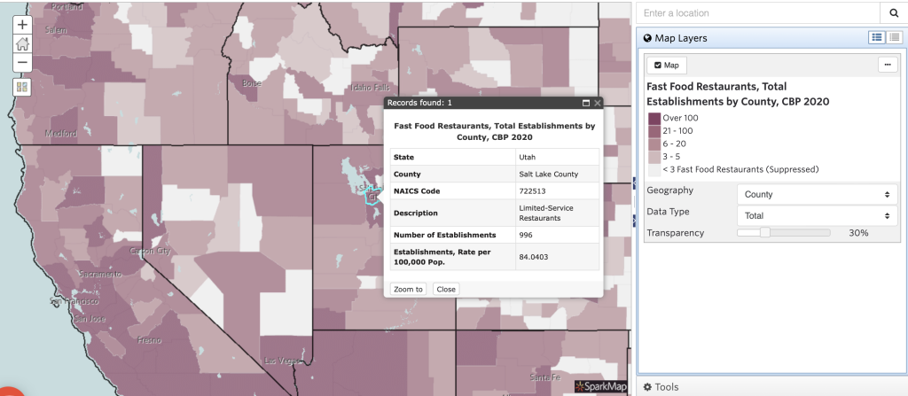
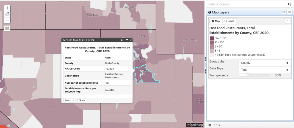
Looking at Figure 1, we can make several claims. First, we can state that in 2020 Salt Lake County, UT had 996 fast-food restaurants. On the other hand, Utah County, UT had 451 fast-food restaurants in total. Therefore, we can conclude there were more fast-food restaurants in Salt Lake County than Utah County in 2020. Additionally, we can examine the rate data represented on the map. Not only does Salt Lake County have more fast-food establishments overall, but there is also a higher rate of fast-food restaurants, at roughly 84 per 100,000 people.
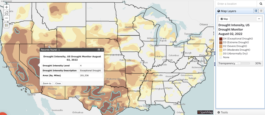
Looking at a different layer, we can make different types of statements. For example, when we look at the US Drought Monitor data layer, we can add up all areas of drought and conclude that as of August 2, 2022, over 2.5 million acres of land in the United States were officially declared in drought (i.e., D1-D4). Of those acres, over 200,000 were in exceptional drought, indicated by crop and pasture loss, fire risk, and water shortages causing emergencies.1
As we explore these single-layer maps, it is important to keep in mind the significant components of data interpretation discussed above: data source, time period, and geography. Data source is important for the audience to understand where the information comes from. Second, noting the time period data reflects is important, as you want to ensure you are using the most accurate measurements available. Lastly, geography and type of data shape the conclusions that can be made and how widely they apply. For example, geography would dictate the areas in which your statements do and do not apply, whereas data type will dictate if you can discuss percentages, total, or rates of the population your data applies to. Overall, when interpreted thoughtfully and accurately, single-layer maps provide a depth of knowledge about community infrastructure, demographics, and statistics. To make claims about relationships and how things interact in your communities, multilayer maps are needed.
How can I interpret multilayer maps?
If you’re unfamiliar with creating multilayer maps, be sure to visit our previous blog focused on creating and understanding such data visuals. In that piece, we highlight several important considerations when creating multilayer maps, such as how to select appropriate layers and ensure they are compatible. Stay tuned for our next data literacy blog, in which we’ll take an even deeper dive into appropriate layer selection.
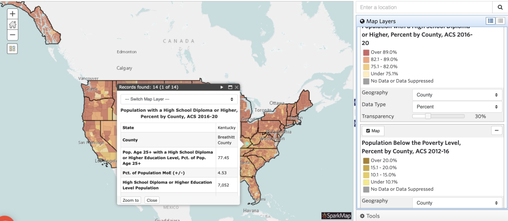
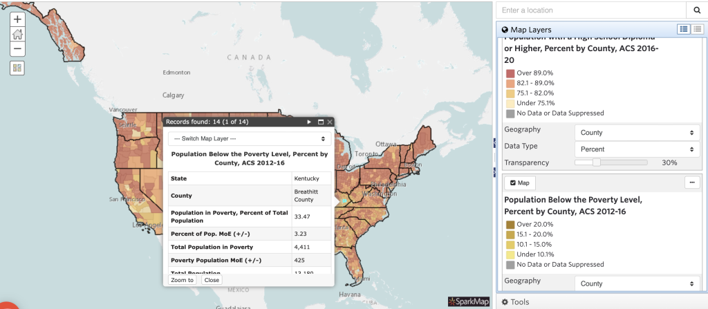
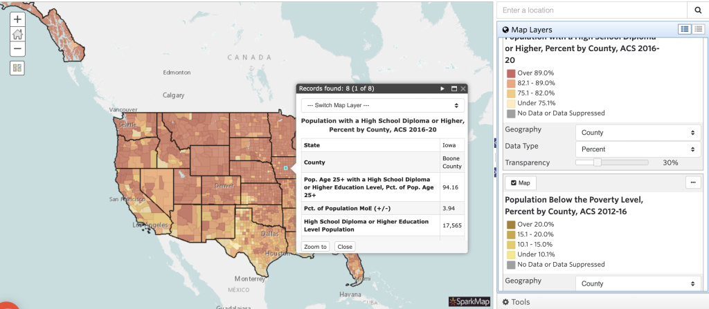
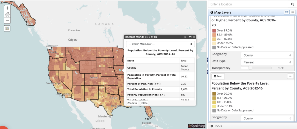
Once you’ve created a multilayer map with these considerations, it’s important you understand how to interpret it. For this example, we will be looking at a map with two layers: 1. population with a high school diploma or higher and 2. population below the poverty line, each at percent by county.
Looking at different locations on the map, we’re able to note some trends regarding educational attainment and poverty. In general, we can conclude that many areas with higher percentage of educational attainment also have lower percentages of poverty. We see examples of this trend when looking at Breathitt County, KY compared to Boone County, IA (Figures 3 and 4). Based on this trend in data, we draw some conclusions around the relationship between poverty and educational attainment.
However, could there be other factors influencing the relationship between poverty and educational attainment? Absolutely. As you add more layers to your maps, you’ll begin to see more of the story. For example, how does unemployment impact poverty or educational attainment? What about access to child day care services or community walkability? We encourage you to add layers to the map and explore how adding multiple layers provides key details to the story of your community.
What’s next?
Now, interpreting data from maps seems pretty simple, right? Well, we’ve just scratched the surface! Come back next month as we get into some of the caveats and complexities of interpreting data. In the next blog we’ll discuss some of the do’s and don’ts of tracking trends, the importance of knowing your data sets, and some of the limitations of data.