
Choosing Locations as a Digital Nomad
Are you one of the millions that work from home as part of the “new normal”? The events of 2020 notably accelerated an already growing trend – the removal of location constraints for many workers. The ability to work from anywhere with internet connectivity is changing the way many people look at the choice of where to live, as available employment in specific areas becomes less central to the decision. A Digital Nomad fully embraces this mobility by frequently relocating, or living a nomadic existence, while working. Factors like broadband access, affordable housing, favorable climates, and accessible public spaces and amenities become key in deciding where to temporarily migrate.
This shift in the way people choose where to live and when to move is expected to fundamentally change communities.1,2 Understanding where Digital Nomads are likely to put down temporary roots is therefore becoming essential to community planning and development, as Digital Nomads temporarily rely on local services such as education and healthcare systems; increase the demand on local infrastructure; and temporarily alter community demographics. Community planners, healthcare systems, and non-profits that understand this trend and its impact on their area have an important advantage in preparing for the future and potentially increasing economic development as Digital Nomads bring new sources of income into communities.
In this blog post, we will:
- Get to Know the Digital Nomad – identify criteria likely impacting Digital Nomads’ relocation decisions
- Evaluate the Large-Scale – assess a broad geographic area in the SparkMap Map Room to identify regions best suited to the Digital Nomad lifestyle
- Take a Closer Look – create a more granular assessment of these criteria at the community level
Get to Know the Digital Nomad
Just how many Digital Nomads are there and what do they want? According to a 2022 report by MBO Partners, the number of people that identify as Digital Nomads grew from 7.3 million in 2019 to 16.9 million in 2022.3 To understand how Digital Nomads might affect your specific region or community, we first need to understand the motivation for the increasing number of workers participating in this lifestyle. While the specific motivations, values, and preferences of Digital Nomads are individualistic, participation in geoarbitrage is a notable characteristic that is particularly relevant to understanding how they may select communities in which to live.3
Geoarbitrage is simply selecting a location base with low costs of living while still earning the prevailing wage of markets with higher costs. For example, one may work remotely for a company based in New York City making a salary conducive to living in Manhattan but choose to live in places with a lower cost of living. This allows participants to take advantage of the price differences between the two locations, thereby increasing their purchasing power. The relative increase in wage is often used for travel, fewer working hours, or an overall improvement in lifestyle. Importantly, this means that Digital Nomads tend to seek out areas with reliable internet connectivity and low costs of living as key factors in their decision-making4.
Evaluate the Large-Scale – A National or Regional View
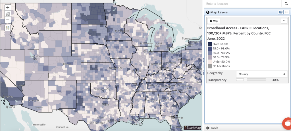
Now that we have some insight into large-scale drivers of Digital Nomads’ decision-making, let’s apply two criteria – high-speed internet access and low cost of living – by finding data for each. Let’s begin by searching SparkMap’s Map Room for a map layer that focuses on broadband. SparkMap offers many map layers related to broadband infrastructure. Selecting the “Broadband Access – FABRIC Locations, 100/20+ MBPS, Percent by County, FCC June, 2022” layer will allow us to assess high speed connection availability (Figure 1).
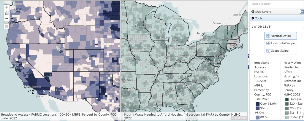
Let’s hone in further with our second criteria – low cost of living – by adding the map layer “Hourly Wage Needed to Afford Housing, NLIHC 2022.” When we look at the data info of this map layer, we see that it has an important characteristic which makes it uniquely relevant to our broad-scale analysis: it does not apply adjustments for prevailing market wage.5 Many of the map layers in SparkMap are adjusted to account for regional variances. For example, in the housing and living cost related layers, these adjustments often factor in the prevailing wage alongside the fair market value of housing. Essentially, in markets with higher housing costs, workers are likely to receive higher wages, and these maps take this into account. In our case, geoarbitrage specifically relies on using the wage of the higher market and the lower living costs of a different market, so that adjustment would negate the factor we are looking for. We want to find markets in which Digital Nomads’ hourly wage exceeds their required housing costs by as much as possible, leaving them the most disposable income. As you can see, while many of the map layers could have been useful in this analysis, selecting and understanding the map layer we will use is extremely important!
Now that we have a couple of layers to look at, we can find locations that offer a good combination of factors, both low housing costs and high broadband coverage. Using the Swipe Layer tool (Figure 2), we can locate areas that are likely to be of interest to Digital Nomads by identifying those which transition between darker shading in the broadband map layer (high coverage) and lighter shading in the hourly wage to afford housing map layer (low cost of living).
Getting A Closer Look – The Community View
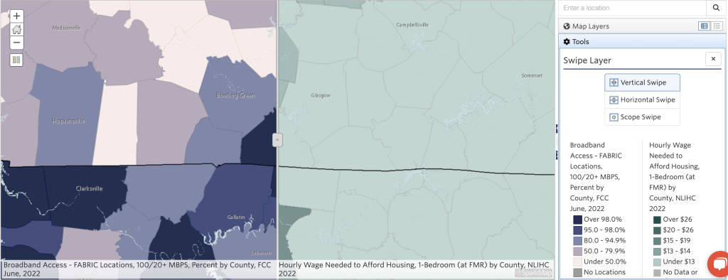
Looking at the larger map, Allen County, Kentucky, located along the Tennessee border, has shading that indicates both the highest level of broadband access and the lowest hourly wage needed to afford housing (Figure 3). So, let’s click and zoom to that location.
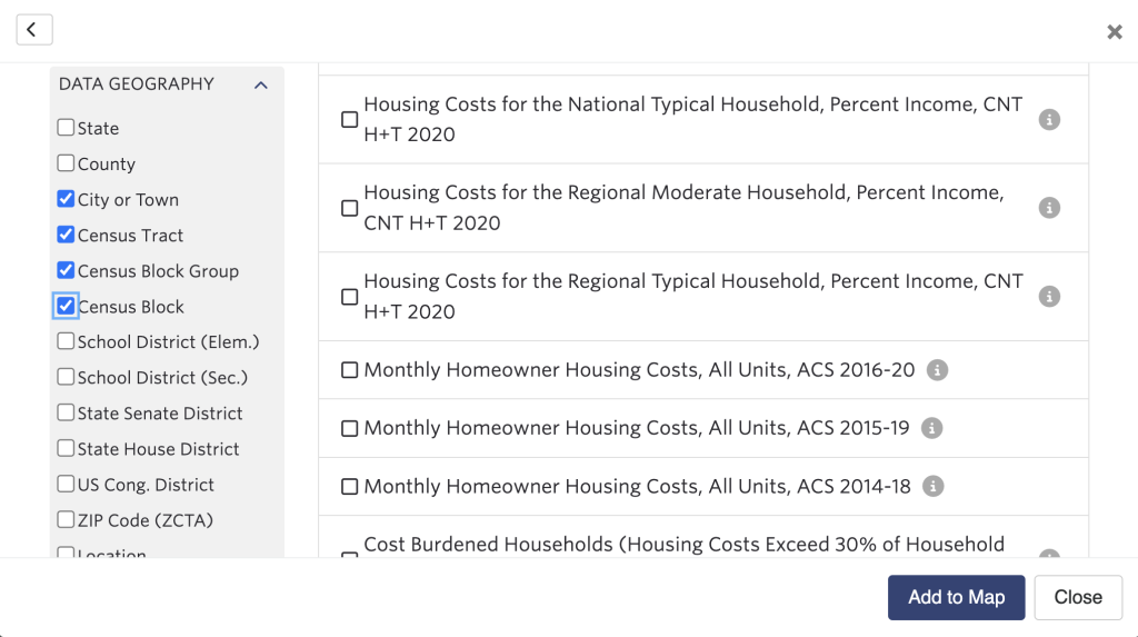
In the broadband access map layer, we can easily change the geography of the data to tract or block group for a more granular view. However, the “Hourly Wage Needed to Afford Housing” map layer is only available at the county level, making it less useful for local organizations and targeted efforts. Matching our data methodology to our needs is essential to gaining insight into our communities. On the local scale, the application of regional variance adjustments, which we wanted to avoid in our larger scale view, becomes less relevant because we are only looking at housing costs within the same or very similar prevailing wage markets.
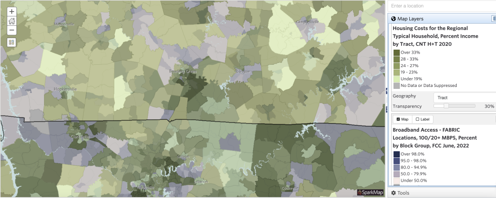
Using the Add Data Search, we can now adjust the Geography Level of the search results to find an appropriate map layer such as the “Housing Costs for the Regional Typical Household, Percent Income, CNT H+T 2020” layer which has tract geography data (Figure 4).
Adjusting the map layers to display different levels of geography can also be helpful when viewing both layers by making them more visually distinguishable (Figure 5). While some housing tracts have universal data coverage, we can see that others show variance in the data coverage by block group within the tract. It is also worth noting that the more granular the data is the more likely it is to have coverage gaps, often due to a lack of sufficient data points.
Conclusion
Using SparkMap to locate potential areas of Digital Nomad activity allowed us to take advantage of one of data mapping’s greatest strengths: human visual processing power! Rather than combing through vast amounts of numeric data, mapping allowed us to quickly locate areas in which multiple factors intersect. Yet, finding locations that meet both broadband requirements and low cost of living for Digital Nomads is just the start. We can further expand by looking for areas that meet additional preferences, such as low crime rates, or access to transportation infrastructure and other amenities. Community planners and developers can use these more specific characteristics to look for areas in which potential shortages of services may occur due to increased population in areas that are likely to attract these workers as temporary residents. Alternately, we can use this information to assist economic development plans by targeting programs to attract Digital Nomads through incentives or community improvements.
Today we looked at Digital Nomads and their implementation of geoarbitrage, an important concept that is expected to drive changes throughout society, including healthcare, education, economic activity and infrastructure. Workers that are removed from or experience reduced geographic constraints are already creating major shifts in population and economic activity across the country. Most experts agree that this trend is likely to continue. Understanding how these workers might change the way we think about community selection and fluidity may provide insight to plan effective strategies for meeting our community’s needs both in the moment and in the future.
References
- https://www.forbes.com/sites/carolinecastrillon/2022/07/17/why-the-digital-nomad-lifestyle-is-on-the-rise/?sh=3758b2a4934c
- https://www.flexjobs.com/blog/post/economic-development-programs-remote-workers/
- https://info.mbopartners.com/rs/mbo/images/2022_Digital_Nomads_Report.pdf
- https://www.statista.com/statistics/1299228/factors-choosing-location-digital-nomads-worldwide/