Heart Disease – Designing Community Interventions
We’re all a little more heart-conscious these days, or should be, given that heart disease is the leading cause of death in the United States. Even as the tragic death toll from COVID-19 climbs, heart disease still claims more lives each year (accounting for 1 in 4 deaths). It’s also projected to be the leading cause of death worldwide by 20301.
How can we use data to help change this, especially in the most vulnerable communities? Today, we’re going to look at community-level maps and data to better understand how to find areas with high risks for heart disease, as well as what kinds of efforts might mitigate these risks.
What we’re going to do today
In this blog, we’re going to look at medical and social risk factors for heart disease in the Map Room. This is a first step in identifying what geographic areas need intervention, as well as what kinds of interventions might be necessary.
- Background: Establish definitions, discuss medical risk factors and contributing social factors
- Heart Disease Prevalence: Contextualize the problem in an at-risk community
- Explore Key Risk Factors: look at geographic data around high blood pressure, high blood cholesterol, and smoking
- Explore Social Determinants of Health: look at geographic data around social conditions, particularly food deserts
Background: Heart Disease Risk Factors
Heart Disease, Medical Risk Factors, and Community Health Data
Heart disease is a type of disease that affects the heart or blood vessels2. The most common form is coronary artery disease (CAD), where there is a narrowing or blockage of the coronary arteries. But there are many other forms including heart infections, diseases of the heart muscle or valves, and heart rhythm issues.
There are many well-known physical and medical risk factors for heart disease. Some of these are unchangeable: being male, hereditary inheritance, and advanced age. However, other risk factors like high blood pressure, high blood cholesterol, smoking, diabetes, being overweight or obese, an unhealthy diet, physical inactivity, and excessive alcohol use can be changed through certain medications and lifestyle modifications.
Picking the Health Data – BRFSS!
CDC BRFSS (Behavioral Risk Factor Surveillance System) PLACES Project data are widely used to assess health factors, behaviors, and outcomes at a community level. For more information read our blog post introducing BRFSS, but here’s a recap:
- Data is gathered from health-related telephone surveys of over 400,000 Americans a year – making it the largest continually collected health survey system in the world
- All 50 states, DC, and 3 US territories are represented
- PLACES reports county-, place-, census tract-, and ZCTA-level data and uses small area estimation methods to obtain 29 (27 in the 2020 release) chronic disease measures for the entire United States.
Social Determinants of Health
Not only do physical characteristics lead to increased risk of heart disease, but where and how we live affect our health and can contribute to the risk factors identified above. We call these living conditions “social determinants of health.”
The World Health Organization describes social determinants of health as the “non medical factors that influence health outcomes.” Income levels, safe housing, transportation, access to education, pollution levels, and access to nutritious food are all examples of these conditions.
Heart Disease Prevalence
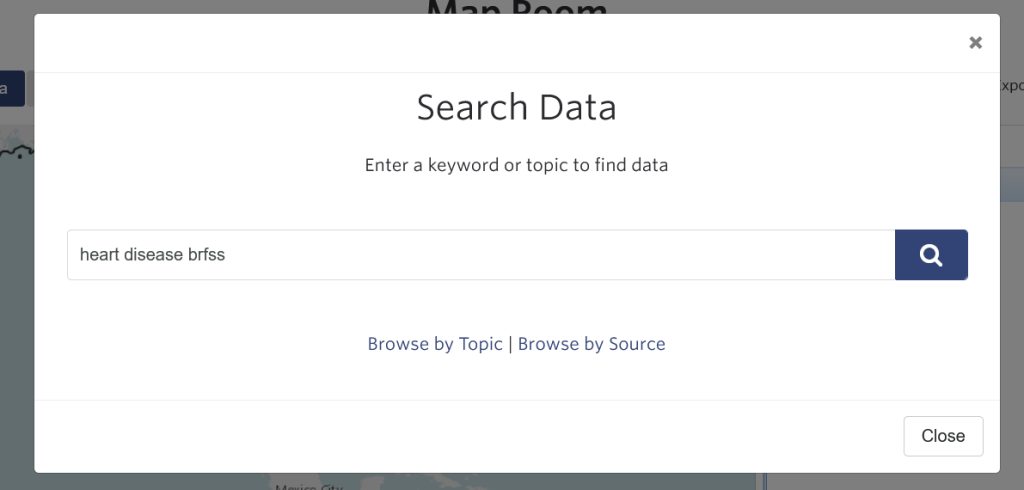
Time to get to work! Let’s use the Map Room to identify communities with high prevalence. We’re going to use St. Louis, MO as our example. For a refresher on Map Room basics, check out our support material on How to Make a Map. Today, we’re searching by the keywords “heart disease brfss” in the Search Data pop up window (Figure 1).
Pro Tip: If you don’t know the exact layer name, keep your keywords simple for the best results. Use short phrases like “blood pressure” and “heart disease”, not “heart disease incidence data from around 2019”.
If you’re following along, once you search for the keywords, follow the steps below.
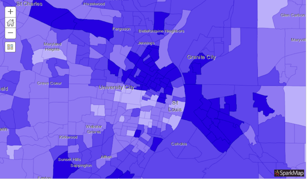
- Click on the checkbox next to the “Coronary Heart Disease, CDC BRFSS PLACES Project 2019” layer (CDC data definition)
- Click the button at the bottom “Add to Map”
- Change the geography of the map to tract
- Zoom in to St. Louis
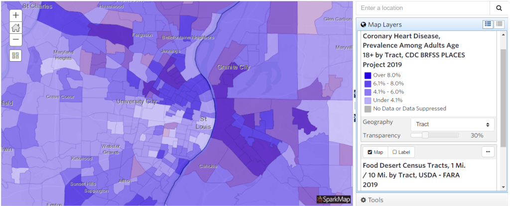
- Final Map: https://cares.page.link/wcQr
What can we see from this map (Figure 2)? The darkest areas represent the census tracts with the highest percentage of adults that are confirmed to have heart disease. We can see that many tracts in north St. Louis, as well as a few tracts in south St. Louis, have the highest prevalence.
Risk Factors – Physical and Social
Knowing which tracts have the highest prevalence of heart disease is important, but to create successful interventions it’s necessary to dig deeper. Which communities have the highest levels of key medical risk factors (e.g., high blood pressure, high cholesterol, smoking)? Which characteristics of those communities contribute to elevated levels of disease? Are there social conditions that contribute to the disease incidences?
Explore Physical Key Risk Factors: High Cholesterol, High Blood Pressure, and Smoking
First, let’s look at map data for the three key risk factors for heart disease: high cholesterol, high blood pressure and smoking. About half of people in the United States (47%) have at least one of these three risk factors.3 Our goal here is to visually identify communities that have high incidence of these risk factors and therefore higher risk for heart disease.
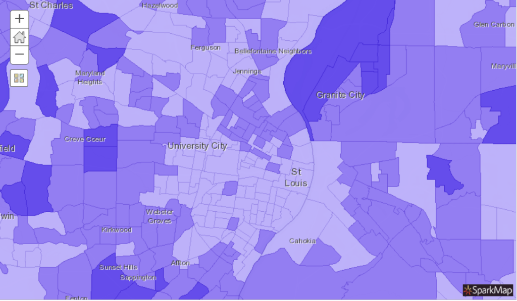
Using the keyword method above, let’s look at the map for the “High Cholesterol, CDC BRFSS PLACES Project 2019” layer (CDC data definition).
What can we see from this map (Figure 3)? The darkest areas represent the census tracts with the highest percentage of adults with high cholesterol. Within St. Louis, many of the same tracts in north St. Louis and south St. Louis also have high incidence of heart disease (Figure 2).
Next, let’s search and load data for smoking, using the “Current Smokers, CDC BRFSS PLACES Project 2019” layer. If we select tract as our geography, we create this map.
Finally, for blood pressure, let’s look at the “High Blood Pressure, CDC BRFSS PLACES Project 2019” map layer.
What do these maps tell us and how do they inform an intervention strategy?
In each map presented here, many of the same census tracts suffer from elevated levels for each risk factor. Therefore, we could concentrate interventions to these areas. But we’re missing the bigger picture – why are these areas disproportionately affected? Why are they more likely to have these negative health outcomes when compared to nearby census tracts?
Explore Social Determinants of Health
When understanding why certain populations experience worse health outcomes, including heart disease, than others we need to look at community-level factors. We know of many ways to lessen the risk of heart disease: stay at a healthy weight, eat a balanced diet, be physically active, don’t smoke, limit alcohol consumption, take care of high blood pressure and high cholesterol, and lessen stress4. Therefore, we need to ask questions about why certain communities aren’t able to mitigate heart disease risk as well as others.
Are there food deserts? Is the community safe to walk and live in? What is educational access like and what are the barriers? What are the pollution levels in the area? Do community members have disproportionately low access to medical services due to lack of insurance, lack of transportation, or lack of facilities? What factors in the community might contribute to stress?
Food Deserts in St. Louis
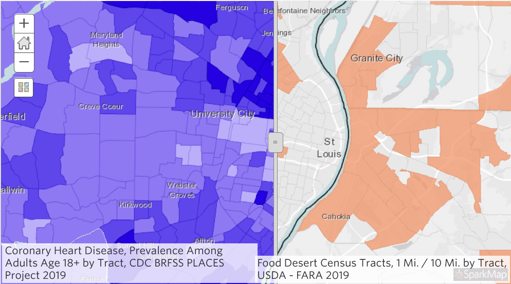
For today, we’ll look at one of these social determinants that is a very hot topic in St. Louis: access to nutritious food. We’re going to use the Swipe Tool to look at heart disease incidence alongside food deserts.
Using the techniques outlined above, let’s add both the “Coronary Heart Disease, CDC BRFSS PLACES Project 2019” (change geography to tract) and the “Food Desert Census Tracts, USDA – FARA 2019” layers to a new map in the Map Room. View the resultant map. (Figure 4).
Having both map layers visible on top of one another isn’t very useful. Instead, we’re going to use the Swipe Tool as a way to look at the layers simultaneously and separately. Intriguing!
To use the Swipe tool:
- Click on the “Tools” button at the top of the Map Room
- Click on “Swipe Layer”
- Explore the resultant map.
What do these maps tell us and how do they inform an intervention strategy?
On the left side of the map, we see heart disease. On the right, we see food deserts. If we swipe back and forth, we can easily locate census tracts with high heart disease and that are considered food deserts. If we click on a particular census tract, we can see more specific data.
Replicating this process with other social determinants of health can help illuminate resources that are lacking or barriers that exist for residents to live an active and healthy lifestyle. In turn, this information can help create successful interventions.
Conclusion
Whew! We did a lot in this blog. Not only did we look at heart disease incidence, but we identified areas that had high prevalence of key medical risk factors, as well as a social determinant of health that may all contribute to heart disease. Using data in this way can help communities better understand where to focus improvement efforts, as well as what efforts might have the most impact.
Stay healthy!
- https://www.ncbi.nlm.nih.gov/pmc/articles/PMC2949987/
- https://www.cancer.gov/publications/dictionaries/cancer-terms/def/heart-disease
- https://www.cdc.gov/heartdisease/about.htm
- https://medlineplus.gov/howtopreventheartdisease.html
Featured image: “hearts” by emilyrachelmartin