2024 Year in Review
2024 was a record-breaking year at SparkMap! More of you joined SparkMap to understand and improve your communities than ever before, the SparkMap team introduced a new Map Room interface, and we created more streamlined and innovative tools to enhance your experience.
While SparkMap grew and changed this year, one thing remained the same: our commitment to providing timely, relevant, and usable data. With this data, you made more Maps and Community Needs Assessments than ever on the site. Let’s check out your work!
62,438 Maps made in 2024!
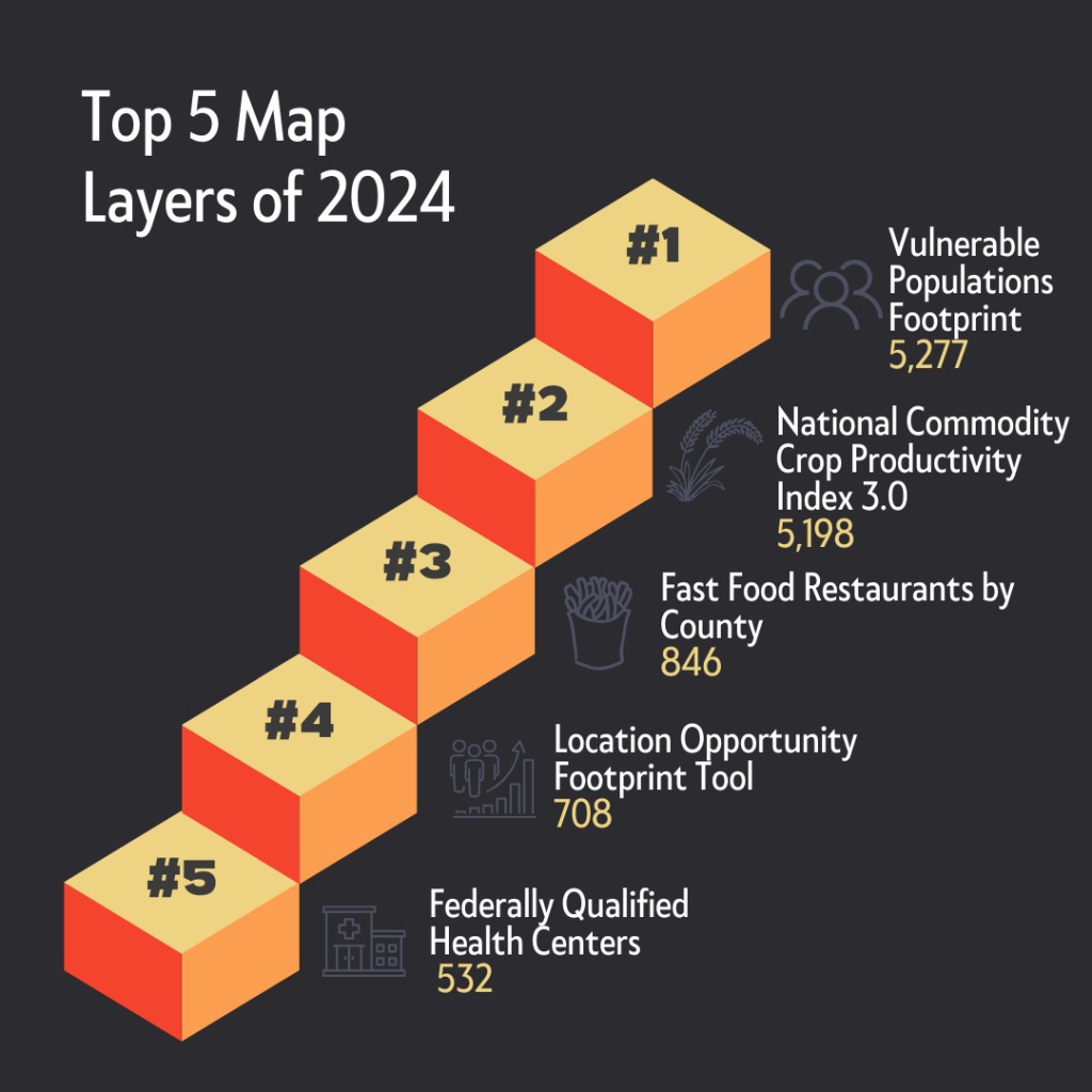
In 2024, you made over 64,000 maps—more than double the number made in 2023! This year, you were most interested in learning about the vulnerabilities, opportunities, and health-related aspects of your communities. For the third year in a row, the Vulnerable Populations Footprint was the most popular layer, appearing in over 5,000 unique maps! As a new addition to the Top 5 layers of 2024, you included the Federally Qualified Health Centers layer on 532 unique maps. With four of the above layers appearing in SparkMap’s Top 5 for the second year in a row, it’s clear these data provide valuable information on communities across the country. If you haven’t yet, check out the Top 5 Map Room layers of 2024: Vulnerable Populations Footprint, National Commodity Crop Productivity Index 3.0, Fast Food Restaurants, Location Opportunity Footprint, and Federally Qualified Health Centers.
87,498 Community Needs Assessments in 2024!
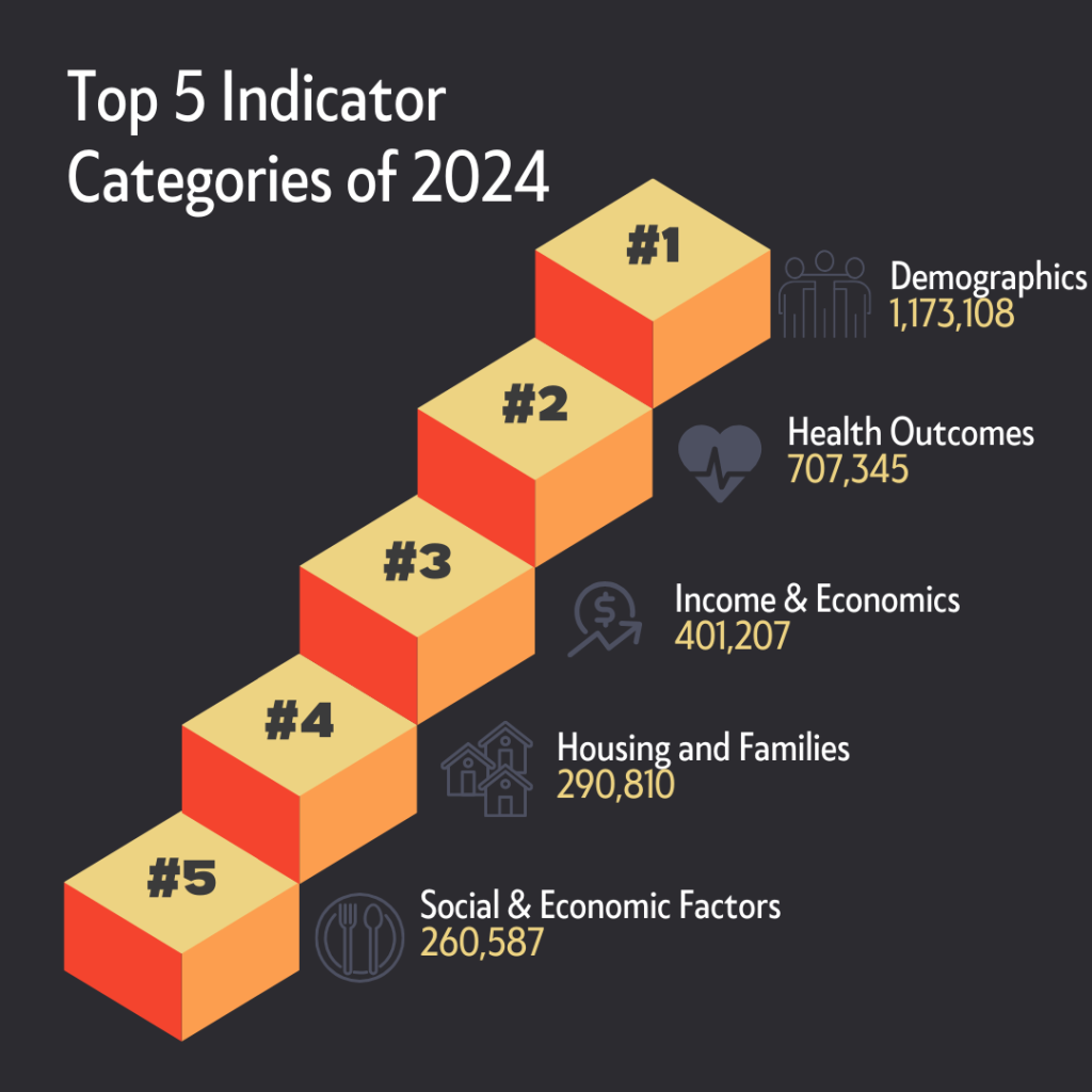
In 2024, we reached the millions club! You included 1,173,108 Demographics indicators in Community Needs Assessments. Some of the most popular Demographics indicators included Total Population, Population with Any Disability, Urban and Rural Population, and Population Change. As you learned more about the makeup of your community, you also focused on their wellbeing by looking closely at Health Outcomes, Income & Economics, Housing & Families, and Social & Economic factors. Explore our full indicator list to dig even deeper in 2025.

