At the time of writing this post, both the labor market and educational systems have recently experienced a massive disruption due to the COVID-19 pandemic. The current state of tenuous employment opportunities will likely leave more people houseless, impoverished, and vulnerable. Additionally, educational opportunities have not been as available, especially to those lacking in home computers and broadband. As a result of these two conditions, health outcomes will likely be impacted in coming years. This situation highlights the ongoing need for interventions and investments in areas with vulnerable populations.
In this week’s post, we will help you understand how to use our Vulnerable Populations Footprint Tool to:
Identify and prioritize areas for investment and intervention
Ensure programs are reaching areas of greatest need
Consistently consider vulnerable populations as you explore other data in your community using SparkMap’s data and layers
Research shows that certain populations are more at risk for mental illness, chronic disease, higher mortality, and lower life expectancy1. More than any other factors, there are two key social determinants, poverty and education, that have a significant impact on health outcomes.
Adverse health outcomes in vulnerable populations have many causes. There are direct correlations between health outcomes and certain circumstances often faced by vulnerable populations more than non-vulnerable populations. For example, data show that those living in impoverished or low-income situations are more likely to:
lack adequate access to quality health resources
lack clean air and water
lack access to safe neighborhoods
experience violence2
drop out of school3
Vulnerable Populations Footprint Tool
The SparkMap Vulnerable Footprint Tool (VPF) can help communities address these disparities by identifying vulnerable populations at a sub-county level. The tool highlights the overlap between areas with high rates of poverty and areas with low rates of high school graduation. Specifically, the data layers examined include:
Percent of Population Below the Poverty Level, Percent by Tract, ACS 2015-2019
Percent of Population without a High School Diploma, Percent by Tract, ACS 2015-2019
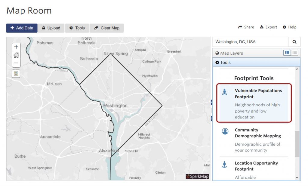
Accessing the VPF Tool
The VPF tool is available in the SparkMap Map Room. Once in the Map Room, navigate to a location where you’d like to explore vulnerable populations. Next, navigate to Tools and select “Vulnerable Populations Footprint Tool” (Figure 2)
Figure 2. VPF Tool location in Map Room
Using the VPF Tool
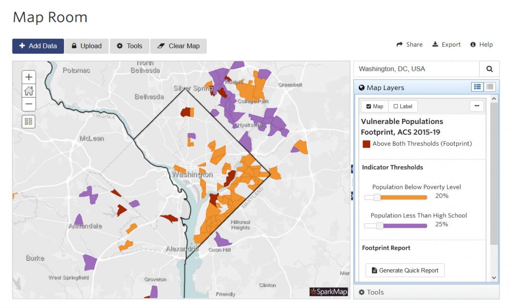
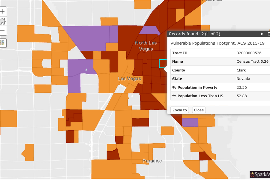
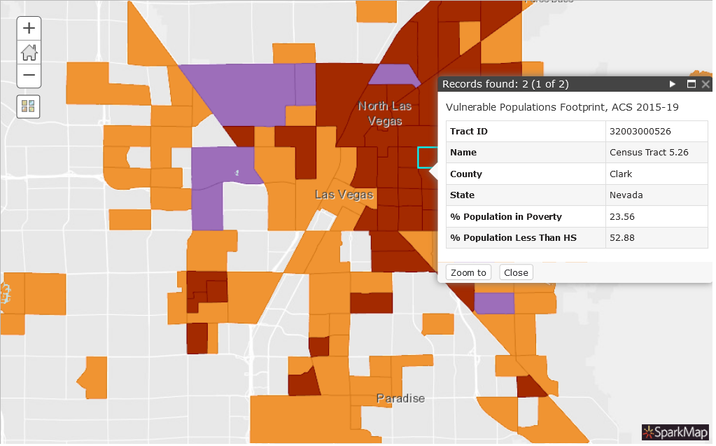
Once you’ve opened the Tool, the map will populate with colors representing three thresholds (Figure 3):
Orange represents population below the poverty level
Purple represents population with less than a high school education
Maroon represents our potentially vulnerable areas – where both indicators exceed the default thresholds
Once you’ve loaded the VPF tool, adjust the threshold values using the sliders – the map will dynamically populate areas affected by the updated thresholds. We recommend that you adjust these thresholds based on the unique conditions of the area you are examining.
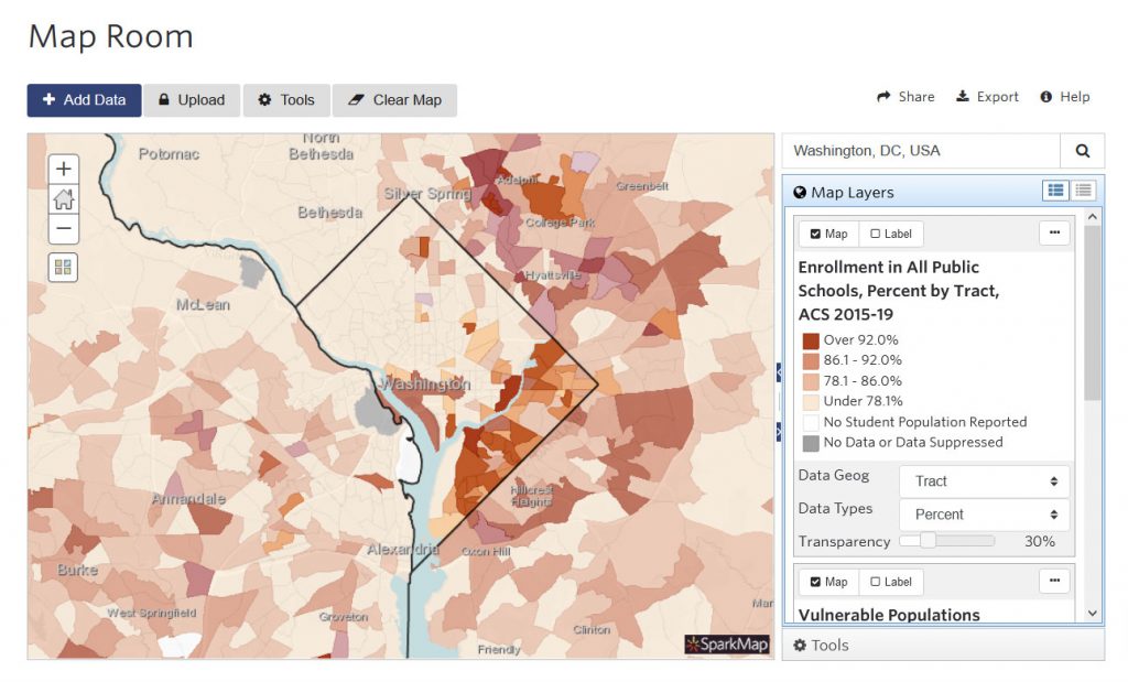
Overlay other map layers
You can easily map other data with this tool. Click the “Add Data” tab at the top left to start adding layers to your map. For our example below, we choose enrollment in public schools – the enrollment layer and the VPF are now both visible on our map (Figure 4).
You can continue to add additional layers, save, export, or share your map. For more information on how to use the Map Room, check out our support materials.
But wait, there’s more
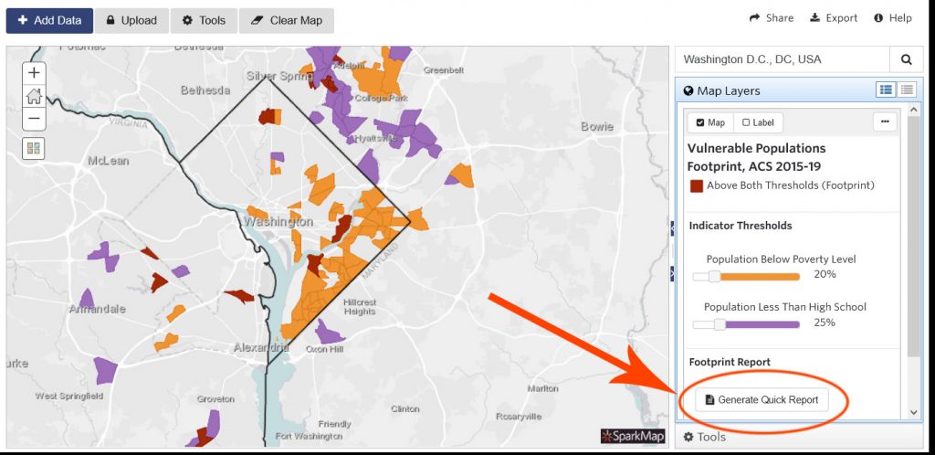
The VPF Tool also includes a handy Quick Report that summarizes demographic information as well as additional vulnerable population data.
Figure 5. Quick Report button
Identify Vulnerable Populations with the SparkMap VPF Tool and help change health outcomes in the communities you care about. For a more thorough walk-through of our Map Room and Community Needs Assessment tools, check out our support materials.
Note: Although we can identify what areas have overlap in low-income situations and low education situations, the resulting areas DO NOT necessarily represent individuals with both characteristics at the same time.
Community Health Needs Assessments (CHNAs) have evolved in many ways over the last ten years. We’re excited to share 5 best practices we’ve learned for selecting CHNA data.
Can you survive the Zombie Apocalypse? Using the Map Room, chart your route to the nearest hospital, supermarket, drug stores, and warehouse stores to ensure you can get supplies. Find out how!
The National Commodity Crop Productivity Index 3.0 is an invaluable tool to evaluate soil productivity. In this blog we discuss background information on the index, reasons to use it, and how to interpret it in our Map Room.
The US Census Bureau has changed demographic questions in response to a changing country. Read more about how these changes reflect increased diversity of Americans, why these modifications matter.
We have updated the American Community Survey (ACS) 5-year estimates on SparkMap! Read more about what the ACS is, what exactly has been updated on SparkMap, and how these changes impact you.

 Orange represents population below the poverty level
 Purple represents population with less than a high school education
 Maroon represents our potentially vulnerable areas – where