COVID-19 Spread and Long-Term Consequences
Blog Objective: Demonstrate how SparkMap’s map and assessment tools are used to understand COVID-19 cases and their consequences.
Users will be able to:
- Use the Map Room tool to visualize the severity of COVID-19.
- Jointly utilize the Map and the Assessment tools to find trends over time and to compare locations.
- Utilize multiple layers/indicators to analyze their relationship (e.g., COVID-19 vs unemployment).
COVID-19 has severely affected the economy, health, and mental well-being of every community around the United States. While most people, families, and towns affected by COVID-19 recover and seek to return to normal health and everyday activities, many will face long-term negative consequences. Some of the negative outcomes can include: significant reductions of income, increased unemployment, and disruptions in education, transportation, and service industries. Thus, proactive recovery strategies are needed to improve communities’ resilience and economic prosperity.
How SparkMap can help
SparkMap provides real-time data sharing, analysis, and visualization—key strategies for an equitable and speedy recovery. Our team is constantly finding new data and providing updates to gain further insight about COVID-19 and its consequences. The Map Room and Community Assessment tools help you visualize, compare, and contextualize demographic, health, socio-economic, and environmental characteristics and find trends over time. To demonstrate how to use our tools, as an example, we focus on Maricopa County in Arizona and ask the following questions: “How has COVID-19 impacted this community and what resources and services might be needed to remedy some of the negative socio-economic outcomes?”
Identify COVID-19 Cases Rates using the Map Room
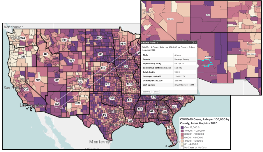
Let’s begin with the Map Room. We’ll search for and select the layer for “COVID-19 Cases, Johns Hopkins 2020.” The interactive map allows us to zoom in to our area and click the county of interest, Maricopa County, which then provides us with a pop-up menu where we can see total population and total deaths (Figure 1 – upper right). The map legend (bottom right of Figure 1) helps understand the range of cases for comparison to other counties in the state and/or nationally. Thus, Maricopa’s COVID-19 cases show a similar rate within the state, but it is higher than many surrounding state counties like those in New Mexico or Nevada.
Cases over Time with the Community Needs Assessment
The Map Room helps visualize the data at a given point in time (i.e., the last update), but the Community Needs Assessment also shows trends over time and provides numeric evidence of how the study area compares to the state and the United States. For our example, after choosing the study area (Arizona > Maricopa County) and then selecting a specific indicator or set of indicators based on a topic, such “COVID-19 – Confirmed Cases” under “Special Topics,” we get access to various tables and graphs. Figure 2 shows a graph of Maricopa County’s COVID-19 cases over time, which shows an increase in the last three months. Table 1 further shows the total number of cases in the last update and provides a benchmark on how the county is doing in comparison to the state of Arizona and the United States.


Adding ICU Bed Map Layers for a More Complete Analysis
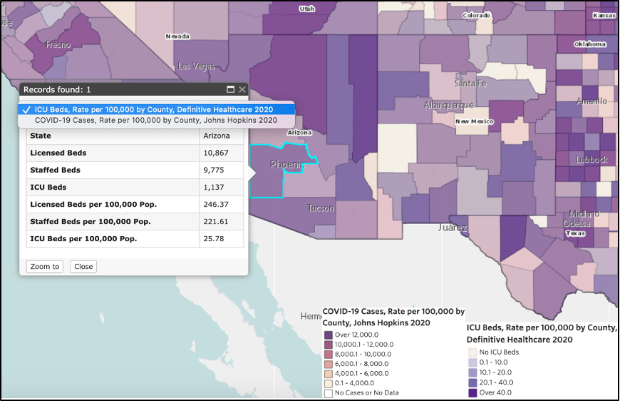
The map and community needs assessment tools helped us identify current COVID-19 case levels in a particular county, which is vital knowledge when requesting and allocating resources or creating policies. The information from our example can help prevent hospital overcrowding or identify counties that need stricter social distancing policies. Remember, you can include other map layers and overlap them to identify clusters, such as general demographic characteristics or specific ones like “ICU beds used by COVID-19 patients.” See Figure 3 of COVID-19 cases overlapping with available ICU Beds in the study area, Maricopa County.
Complementary Unemployment Data in the Community Needs Assessment
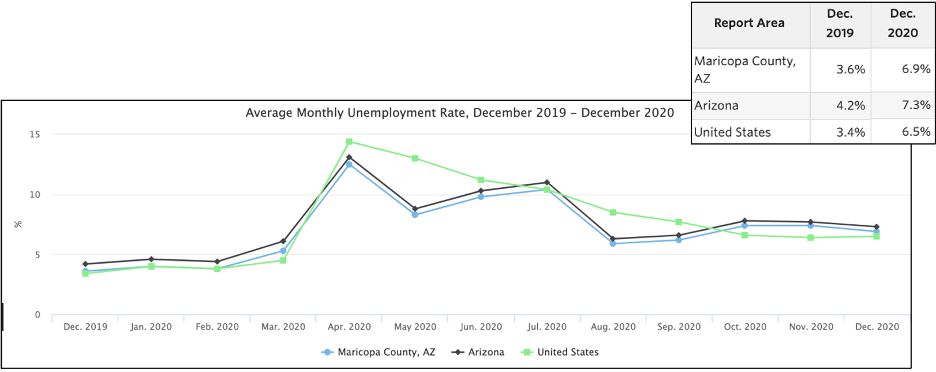
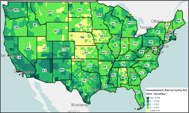
Finally, one of the biggest impacts from COVID-19 has been on the economic sector, which is often analyzed through unemployment rates. Figure 4 shows an increase of unemployment during the year of 2020 for Maricopa County, which on average shows a similar trend than at the state and national levels. However, these averages are a good starting point of comparison and so we also recommend looking at a Map Room layer of the same or a similar topic (Figure 5) to more deeply analyze how COVID-19 impacted unemployment in 2020.
Next Steps
Overall, this blog serves as a guide on how to jointly utilize the SparkMap Map Room and Community Assessment to visualize and understand COVID-19 cases and trends. Most importantly, you can use and compare multiple layers and indicators to identify at-risk areas and/or provide evidence for future funding and resource allocation opportunities. Use our Map Room and Community Assessment for free and access more indicators and features with a subscription. Contact us for questions or a demonstration, and use our support page.
References:
- https://www.ncbi.nlm.nih.gov/pmc/articles/PMC7162753
- https://www.bmj.com/content/371/bmj.m3687.short
- https://www.frontiersin.org/articles/10.3389/fpubh.2020.00241/full
- https://voxeu.org/article/economic-consequences-covid-19-multi-country-analysis
Graphs:


