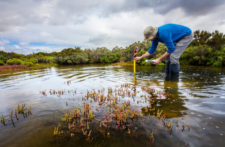
Environmental Data and Park Access
A silver lining of a deadly and frustrating year is the effect the multiple lockdowns have had on our relationship to the natural world. We drove less1. We got outside more – local park use increased2 and first-time campers in 2020 increased 5 fold over the previous year3. And we breathed cleaner air – US carbon emissions in 2020 fell more than 12% from 2019 levels4. Research, and personal experience for many, has shown the positive relationship between time outdoors and our physical and mental health. We owe it to ourselves and the next generations to care for and appreciate the outdoors.
SparkMap offers several ways to help understand our environment and to promote our parks and wild spaces. We’ll focus on using the Map Room to learn how to:
- Find data and local maps on natural features and other environmental data
- Explore how to use SparkMap to make the case for park access
Parks, Air Quality, Waterways – how can I find the data I need?
You can access environmental data in both the Assessment and the Map Room. In the Assessment, environmental data available is listed on Step 2: Indicators, under Physical Environment. We offer several indicators for free in this section (Air Particulates, Drought data, Agricultural Products and more), though you can see more environmental indicators available with each subscription type here.
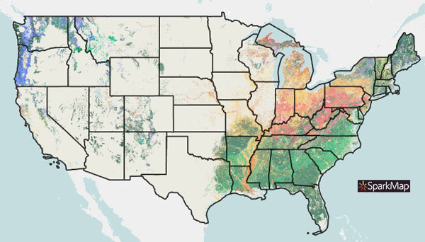
Using the Map Room, you can access and analyze thousands of layers on the environment. We’ve got information on natural features, toxicity, climate, and regulation. You can easily search by keyword, source or topic.
Keyword Search
Searching by keyword is the primary way that people find layers in the Map Room. Our search technology also allows for some fuzzy matching – that means, if you type in ‘park’, you’ll get related layers like ‘wilderness areas’ and ‘environmental areas’.
Browse by Topic
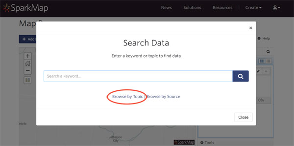
Browse by Topic is a good way to get an overview of the type of data available. If you drill down to Environment, you’ll see varied topics including Climate & Weather, Features & Resources, Pollution, and Water.
Browse by Source
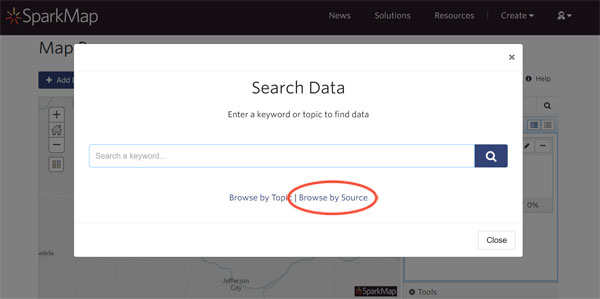
Browse by Source is a more targeted approach to looking at what’s available. Navigate data by who publishes it – we source data from a hundred providers, including the Bureau of Land Management, Census of Agriculture, and the National Oceanic and Atmospheric Administration.
Making the Case for Parks
According to the National Recreation and Park Association, proximity to parks/recreational facilities and the number of parks/recreational facilities nearby are both associated positively with physical activity in nearby communities. Understanding regional information about green spaces and the environment can help in site selection to promote health (where to place an after-school facility, a nursing home, public housing, etc.) and in making the case for park and recreational funding.
When lobbying for funding in particular, maps and data visualizations are key ways to help understand national, regional, and local situations. Let’s look at a specific use case to show the power of data visualization when advocating for parks.
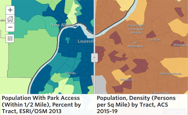
Interpreting and Presenting the Data
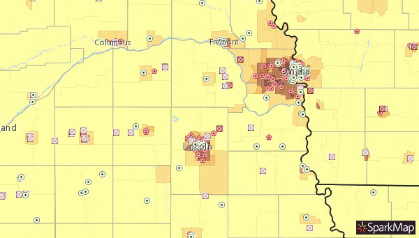
The map shown above is a simple way to explore park location compared with population. In it, we map Population Density (at the census tract level) with Population With Park Access. Sliding the swipe tool back and forth, we can easily look at these two data layers side-by-side – areas of high population may justify continued park funding and, in cases of low park access, new parks may be needed. Additionally, areas of high park access may be better suited for public housing, educational facilities or nursing homes.
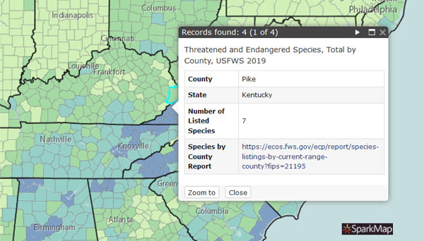
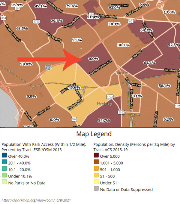
When presenting your findings, you can easily download individual maps of these 2 layers by using the “Export” link at the top right (load one layer at a time and export – or, hide one layer at a time and export). Additionally, you can show one layer as a label (and slide it’s transparency to 100%) and export the results as shown below (click the map or caption to see this live example).
For more information about using our Map Room, visit support. If you’re looking for data you don’t see on SparkMap, or have questions about using SparkMap, reach out!
Sources:
- NHTSA Crash Stats 2020
- Coronavirus Disease 2019, COVID-19, Parks | Health and Wellness | National Recreation and Park Association (nrpa.org)
- KOA’s North America Camping Report 2020
- COVID curbed carbon emissions in 2020
Blog page photo credit: “Central Park Sunset, by the southeast pond near 60th St.” by Dan Nguyen @ New York City licensed under CC BY-NC 2.0