
Diabetes: Assessing Risk Amidst the Pandemic
The month of November is Diabetes Awareness Month. According to an article from the journal Diabetes Care[1], people with Type 1 and Type 2 diabetes are more likely to develop serious cases of COVID-19, including hospitalization, than those who don’t have diabetes. Additionally, healthcare costs are 2.3 times more for patients with diabetes according to the American Diabetes Association and that is without taking into account patients who contract COVID-19. Given these issues, it is important for hospitals, clinics, or healthcare consultants to understand costs and available resources for supporting people with diabetes, especially in high risk areas. But, how can healthcare providers identify those with diabetes and determine strategies to support them? SparkMap can help!
How can SparkMap Help?
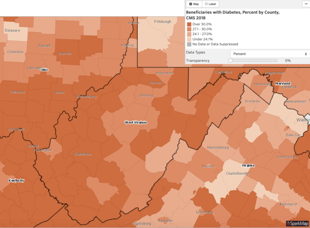
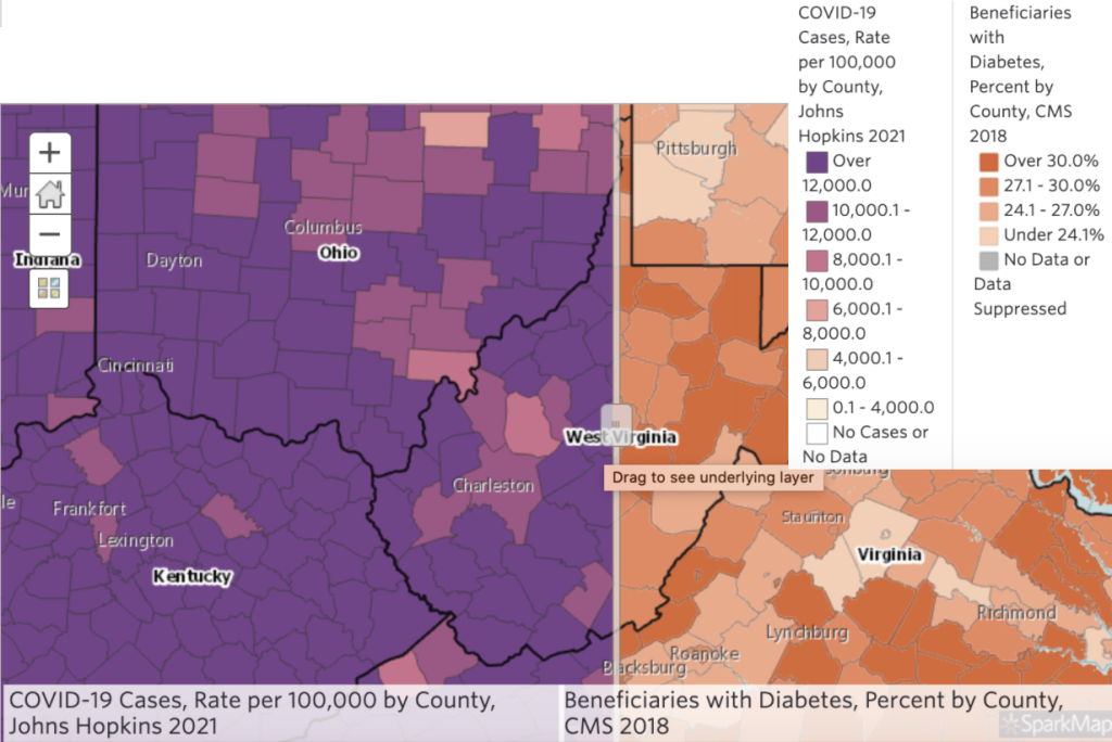
Our Map Room and Community Needs Assessment provide thousands of data sets to help you visualize and identify the health issues in your area, such as concentrations of patients with diabetes in conjunction with high COVID-19 cases. For example, Figure 1 shows West Virginia’s counties and areas in dark orange represent those having 30% or more of Medicare beneficiaries with diabetes. It is also helpful to compare the Figure 1 map with COVID-19 cases by using the swipe tool, as exemplified by Figure 2. Then you can identify what areas are more at risk for both issues, which might call for increased need of funding and resources from the healthcare system.
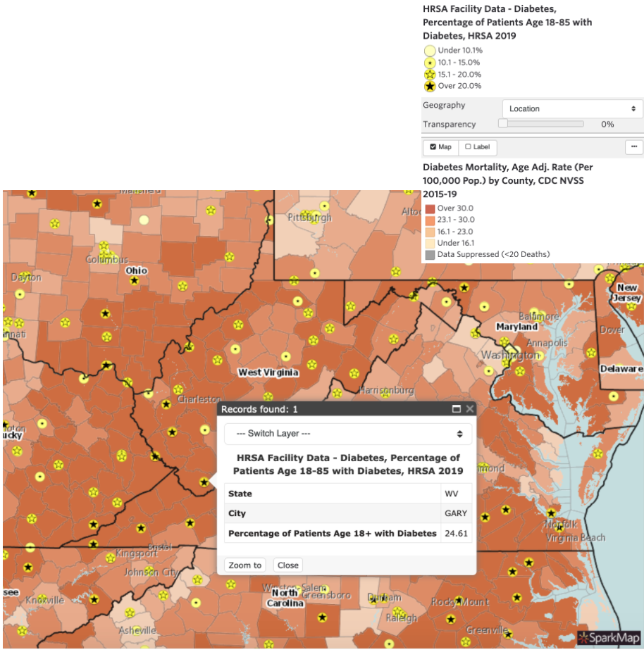
In our Map Room, we can also include a layer to determine the available resources in those areas, such as the location of Federally Qualified Health Centers receiving funding from the Health Resources and Services Administration (HRSA). Figure 3 shows points on the map representing each center and also the percentage of diabetic patients 18 to 85 years old at those centers. In West Virginia, for example, not all counties have access to federally qualified centers and, thus, presents an opportunity for new centers and new resource allocation.
The Map Room provides free access to all of our mapping data and with a pro or premium subscription you can also upload your own data as polygons or points, which can further help you determine areas in need and opportunities for improvement. For example, you can safely and privately upload a CSV table with the addresses of your health team providers and other partners to show coverage or a need for new locations. Accessing thousands of layers through SparkMap can help you show the need of funding and/or prioritize resources in your area. Try our Map Room today and don’t hesitate to reach out if you have any questions.
Resources:
- Diabetes Care: https://care.diabetesjournals.org/content/diacare/early/2020/12/01/dc20-2260.full.pdf
- American Diabetes Association: https://www.diabetes.org/resources/statistics/cost-diabetes
- Map Figure 1: https://cares.page.link/Bw2V
- Map Figure 2: https://cares.page.link/7RKD
- Map Figure 3: https://cares.page.link/bnvK