
Data Dive: State Cancer Profiles
Many types of cancer are on the rise, particularly amongst populations under 501. To better track and understand the significance of these trends, it’s important to have consistently updated and high-quality data available. Each year, SparkMap updates 5-year estimates from State Cancer Profiles. These data are a trusted authority on cancer incidence in the country due to the rigorous standards they must meet and sources they draw upon.
In this blog, we’ll answer the following questions:
What data are described here?
What do these data tell me?
How can I interpret these data?
Where can I find more information?
Let’s dive in!
What data are described here?
State Cancer Profiles is a site developed in collaboration between the National Cancer Institute and Centers for Disease Control and Prevention2. The site was developed to map cancer burden across the US and highlight geographical patterns. To compile the data, State Cancer Profiles brings together statistics from state and local cancer registries. Data from State Cancer Profiles is included in both the SparkMap Map Room and Community Needs Assessment.
Incidence rate and total incidence data for the following cancer types are available for free in the Map Room: All Sites, Bladder, Breast, Colon and Rectum, Kidney and Renal, Lung, Melanoma, Non-Hodgkin’s Lymphoma, Prostate, and Thyroid.
In the Community Needs Assessment, all SparkMap subscribers can access data on incidence for All Cancer Sites. Premium Subscribers can also access indicators on the following specific types of cancer: Breast, Cervical, Colon and Rectum, Lung, and Prostate.
What does the State Cancer Profiles data tell me?
Whether you access these data in the Map Room or Community Needs Assessment, you will find information related to cancer incidence (i.e., the number of newly diagnosed cases during a specified period of time3).
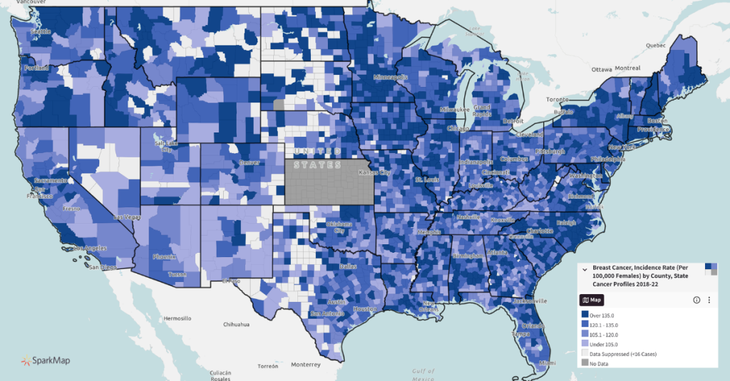
- Incidence Rate data shows the number of new occurrences of the particular type of cancer per 100,000 people during the 5-year period (Figure 1).
- Incidence Total data shows the average annual number of new cases over the 5-year period.
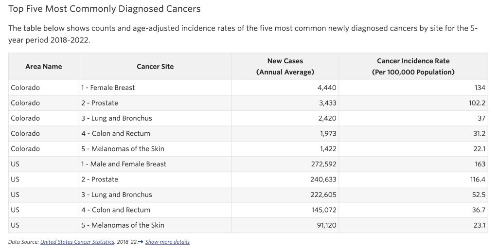
In the Community Needs Assessment, breakout data is also available including incidence by race, ethnicity, and gender. Additionally, the All Sites indicator includes supplemental information on the Top Five Most Commonly Diagnosed Cancers (Figure 2).
How can I interpret these data?
For both rate and total incidence data, you can interpret the information as higher numbers mean higher incidence. Cancer incidence refers to the number of new cases diagnosed over a specific time period, while prevalence reflects the total number of people living with cancer at a given time (including both new and existing cases). Therefore, the State Cancer Profiles incidence data tells you how many new cases of a specific type of cancer were diagnosed within the time period selected.
The Map Room has multiple years of data available under the “Data Type” drop down in the legend pane—this allows you to compare incidence over time. Incidence is important to track because it can capture emerging risk. However, incidence can also be sensitive to changes in screening patterns, so interpret trends with caution.