
How to Use and Filter Indicators by State Benchmarks
See which Assessment indicators are performing better or worse than the state average. Easily filter your reports by showing only those indicators that are performing better or worse than the state average.
★ Useful for All Users; Filtering for Premium Users
This tutorial is for you to identify whether a particular indicator is performing better or worse than the state average for that indicator. In this reference you will learn how to:
- Understand whether an indicator is performing better or worse than the state average for that indicator
- Easily create Assessments that only show indicators better than or worse than the state average (*Premium subscribers only)
Preparation
Before we can filter a report by better or worse than state average, we need to run an Assessment. This Assessment can be for any geography you’d like, depending on your subscription level: county, state, ZIP code, custom area, etc. Visit our Community Assessment Walkthrough if you need a refresher on how to build an Assessment and our Pricing page to see what geographies are available at each subscription level.
For our example today, we’ll select all indicators for Alameda County, CA. Follow along using this Assessment.
Finding the Benchmark Dial
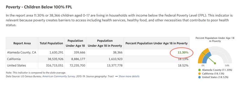
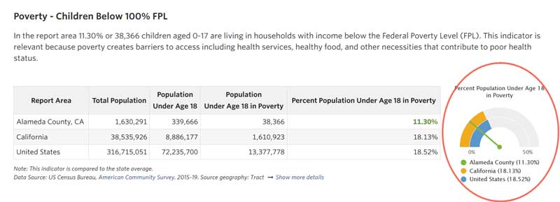
When we can and when it makes sense to do so, we show indicator data benchmarked against the state and the United States averages. We feature this information in two ways: in green or red text in the indicator’s data table, and in a dial alongside the data table. Text highlighted in green highlights the indicator is performing better than the state average. Whereas, text highlighted in red indicates performance worse than state average.
Filtering an Assessment to show only better or worse than state average
If you are a Premium subscriber, you can also easily generate an Assessment showing only indicators that are better or worse than the state average.
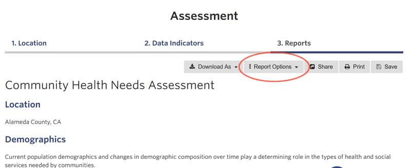
After selecting your Location and Indicators, allow the Assessment to load completely. Then, click the Report Options button at the top of the Assessment to see the filtering options available.
When you click that button, you’ll see the “Indicators better than state average” and “Indicators worse than state average” report options.
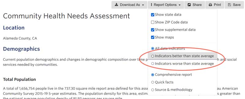
Click on the option you’d like to filter your Assessment by. Viola! You now have a report with only Indicators better than or worse than the state average.
What if I’m running a report for multiple states?
We take a conservative approach to filtering indicators by state benchmarks. If the indicator for a selected area is better than all states encompassed in the Location selected, it will show green and be included in the “better than state average” report. If the indicator is worse than any state average, it will show red and be included in the “worse than state average” report.
More questions on Assessment features? Email us at sparkmap@missouri.edu