How to Build a Community Needs Assessment
Create a county-level Community Needs Assessment in three easy steps. All SparkMap visitors can create single county-level Community Needs Assessments. Looking for more advanced reporting options? Check out our Premium Subscription.
Select Your Location
Select Your Indicators
Generate Your Report
Save and Download Your Report
Step 1 – Select Your Location
Begin by selecting the state you would like to assess.
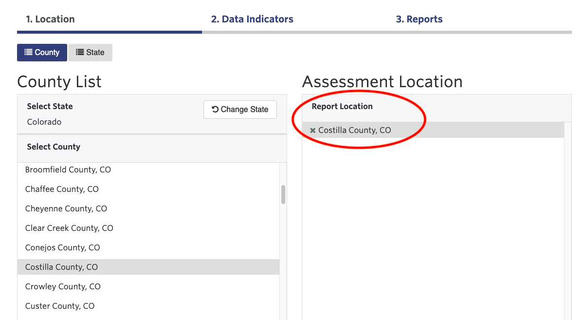
To create a county-level report, click the name of your state first, then a list of counties will populate. Next, click the name of your county. Your selection will show in the pane on the right (Figure 1). To select multiple counties, you must have an Intro, Pro, or Premium SparkMap Subscription.
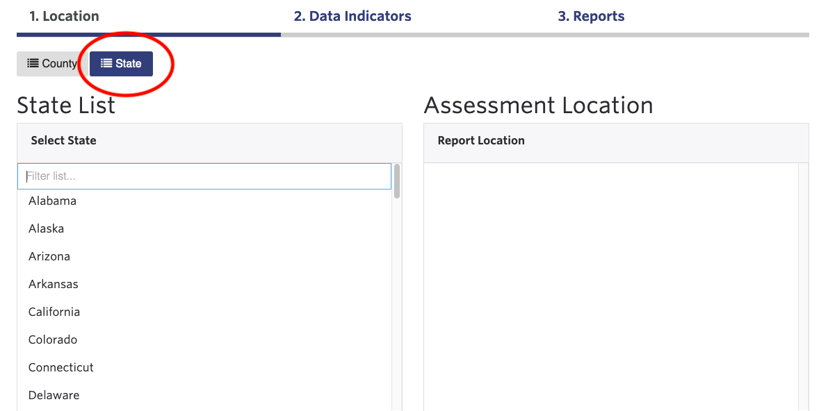
To create a state-level assessment, click the “State” button first, then click the name of your state (Figure 2).
Click the “Data Indicators” button at the bottom right to move to Step 2.
Step 2 – Select Your Indicators
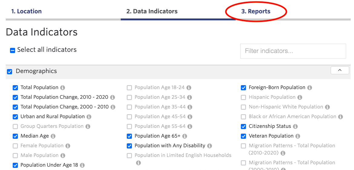
Select all indicators you would like to include in your report.
To select all available indicators, click the “Select All Indicators” checkbox at the top left of the screen (Figure 3).
To select all indicators within a category (i.e. demographics, income and economics, education, etc.), click the checkbox next to the category name.
To reveal a list of indicators available within a category, click the category name. Click the checkbox next to one or more indicators to add them to your final report.
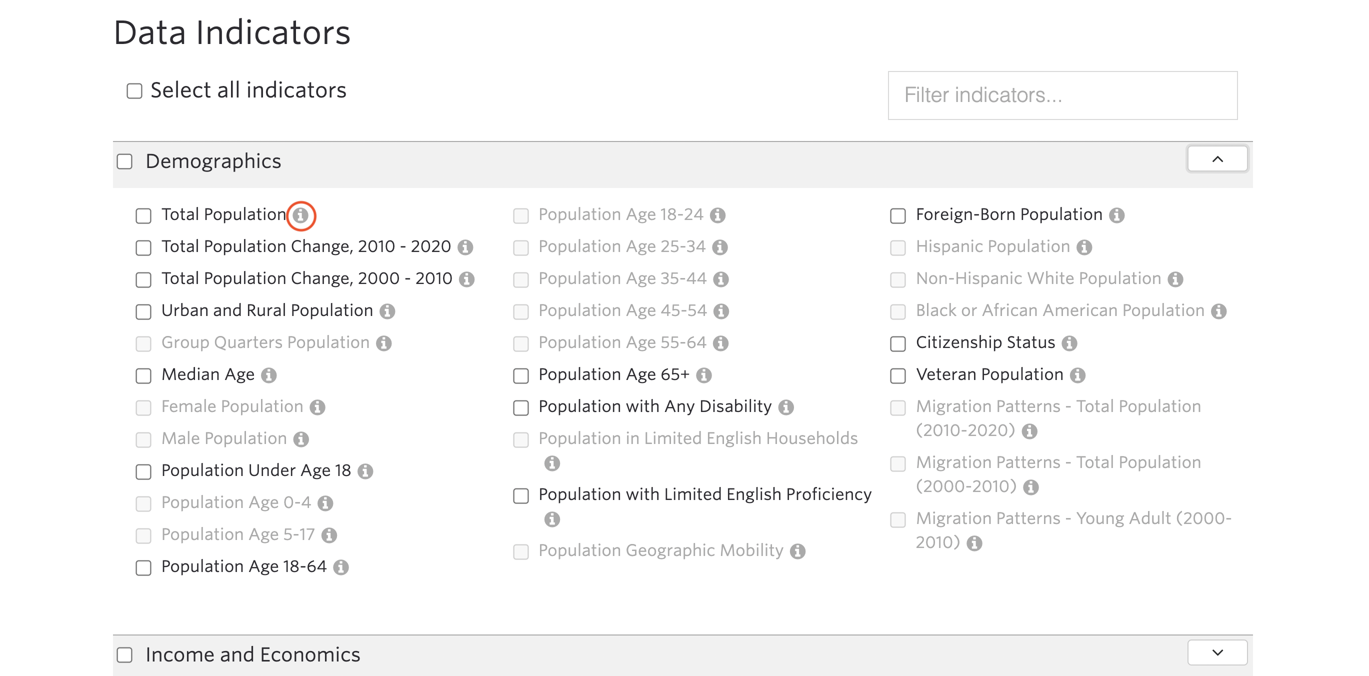
To learn more about an indicator, click the “i” button beside it (Figure 4).

Step 3 – Generate Your Report
Click the “Reports” button (Figure 5) to generate your report.
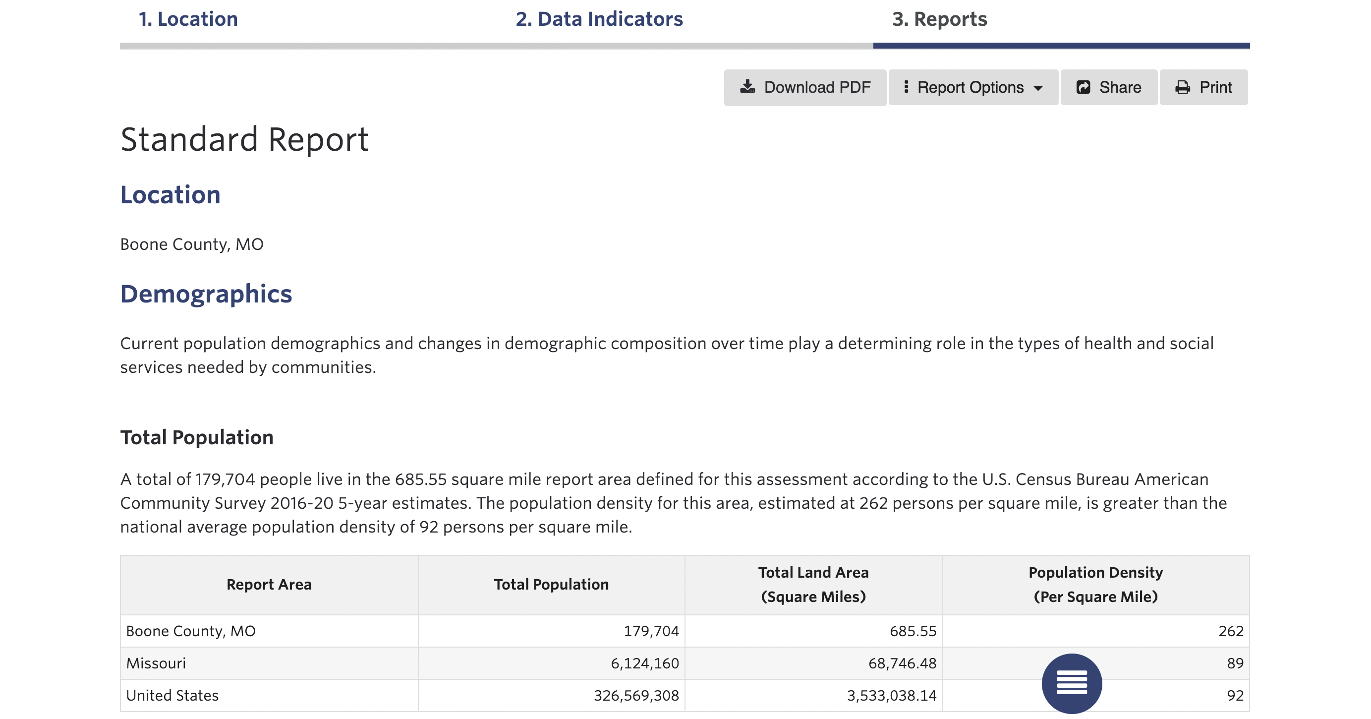
Your completed report (Figure 6) includes dynamic introductions, data tables, benchmarks, and visualizations for each indicator selected in Step 2.
Reports also include breakout data where available. Breakout data refers to sub-categories of data within an indicator. For example, the “Total Population” indicator provides breakout data by age, gender, race, and ethnicity. To see which indicators have breakouts, view our indicator breakout list.
Step 4 – Save and Download Your Report
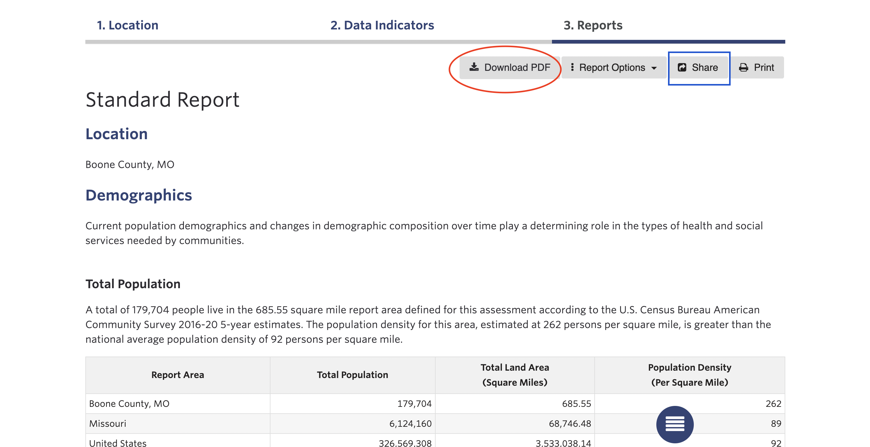
To download your report as a PDF, click the “Download” button (Figure 7). Premium Subscribers can download to PDF, Word, and Excel.
To share your report via email or social media, click the “Share” button. Click the “Print” button to print.
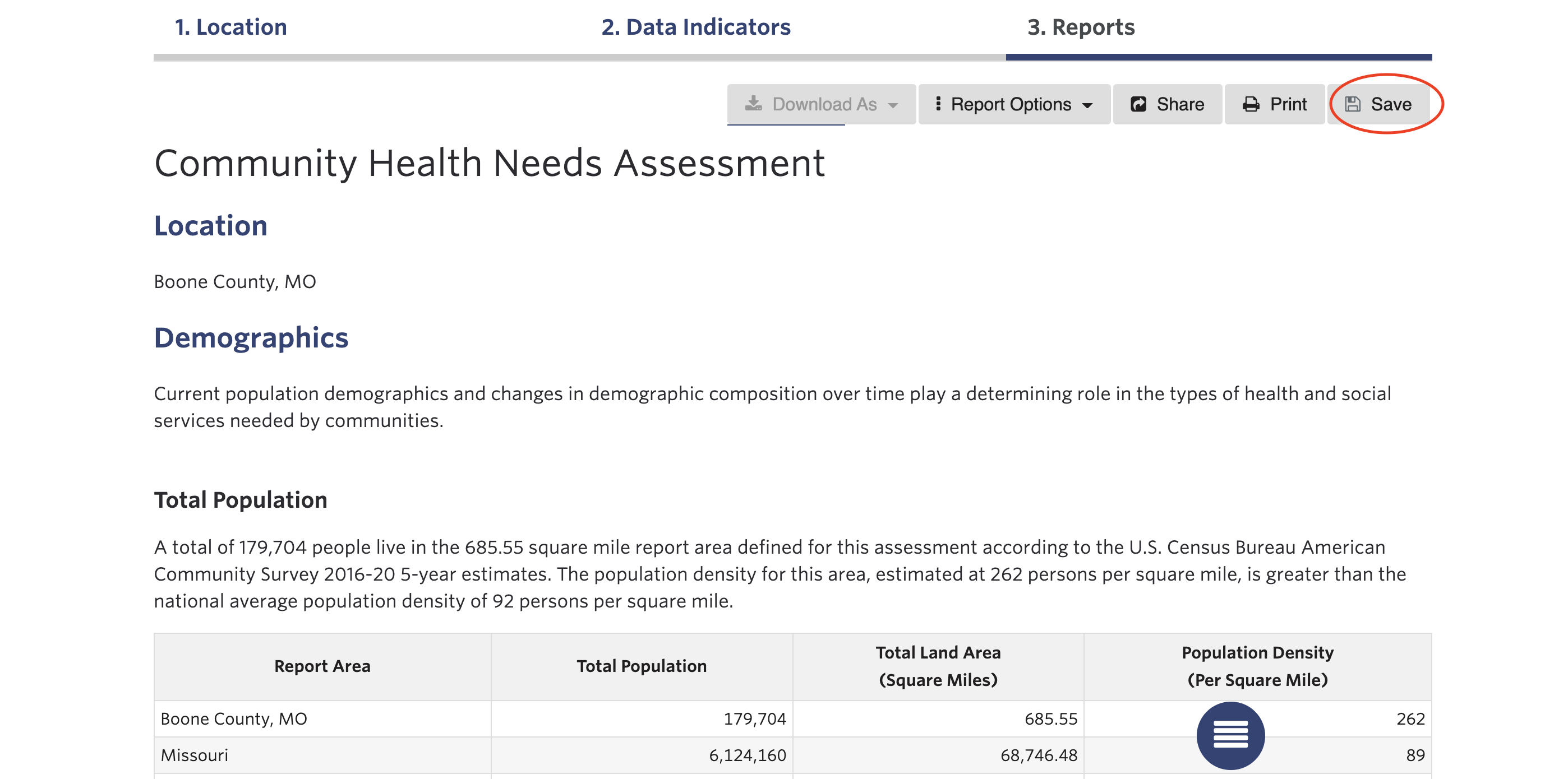
To save a report to your profile, you must be logged in to your SparkMap account. Logged in members will have a “Save” button at the top of the Reports page (Figure 8).
Reports saved on SparkMap update automatically as SparkMap makes data updates.