U.S. Drought Monitor (or, It’s a Dry Heat)
Hot, dry weather has arrived for much of the country. It’s barely summer but we’ve already experienced record heat in many places and drought is prevalent across much of the country. One of our frequently updated datasets, Drought Intensity from the U.S. Drought Monitor, is unfortunately coming into greater use as conditions intensify. Let’s check it out:
What is it?
The Drought Monitor map identifies areas of current drought and labels them by intensity. Each week, drought experts (up to 350!) review dozens of indicators to assess and codify these drought levels. They consider data such as recent precipitation, long-term precipitation, temperatures, soil moisture levels, and water levels in streams and lakes – they also watch for indicators of drought such as vegetation stress.
In essence, this dataset answers the question: “Does the environment have enough water to sustain ecosystems, agriculture, and local economies that depend on it?” (climate.gov)
What do the drought levels mean?
The drought levels, D0 through D4, represent increasing levels of unusual dryness in a region. The least-intense classification, D0 – Abnormally Dry, generally indicates areas on the cusp of drought – either going into one or coming out of one. The most intense classification, D4 – Exceptionally Dry, represents the most extreme level of drought – water shortages in these areas may lead to water emergencies, crops may fail, and tinder-dry forests may be widespread. The darker the color on the drought map, the more intense the drought conditions are in that region.
For more details about the drought levels, visit the U.S. Drought Monitor’s detailed classification here.
Who is this dataset useful for?
This dataset is used mainly by those seeking a weekly, big-picture view of the drought situation. This includes the USDA, IRS, municipal water managers, firefighters, farmers, home buyers, and travelers.
As drought conditions intensify in a region, there’s an enhanced chance for an emergency situation – the chances for crop failure, barren pastures, and fire-promoting conditions all increase. These data affects disaster declarations, loan eligibility, tax deferrals, and water management decisions – since this dataset is published weekly, it’s easy to see trends in a region and to plan accordingly (compare weekly data at the U.S. Drought Monitor site).
Who makes the data?
U.S. Drought Monitor data are produced through a partnership between the National Drought Mitigation Center at the University of Nebraska-Lincoln, the United States Department of Agriculture, and the National Oceanic and Atmospheric Administration.
How can I learn more?
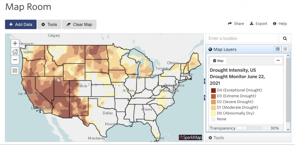
Using SparkMap, you can easily view, query, and map this drought data alongside 30,000+ datasets for your region of interest. Check out the Drought Monitor map in the Map Room: https://cares.page.link/cF7x. For in-depth guides to the Map Room, visit our support documentation – or contact us with questions.
- Visit the Drought Monitor site: https://droughtmonitor.unl.edu/CurrentMap.aspx
- Visit climate.gov: https://www.climate.gov/maps-data/data-snapshots/data-source-drought-monitor
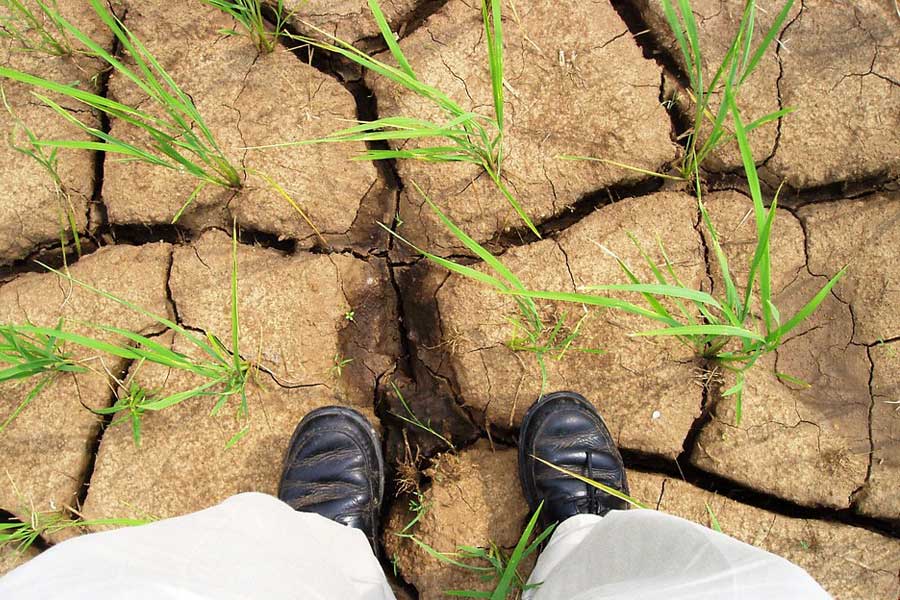
Featured picture: “drought” by IRRI Images is licensed under CC BY-NC-SA 2.0